Did you like the article? Share it!
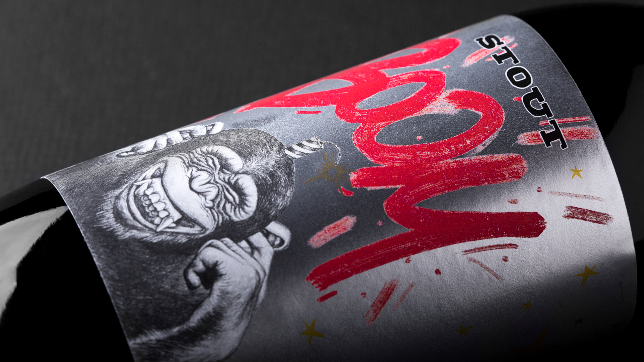
Boom beer: a gold label on a metallic paper
We had the pleasure of interviewing Andrea Basile, creative director of Basile ADV (link: http://www.andreabasile.it/), a creative studio specialized in branding and packaging design, to talk about their award-winning creation: the beer label Boom, characterized by a street style and by the use of the metallic paper that creates interesting light effects…
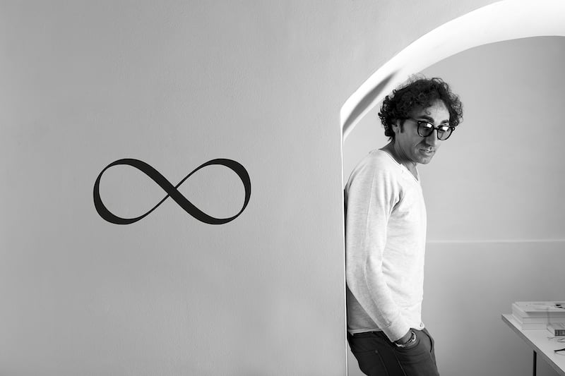
1. Describe your job. What do you do, what are your peculiarities and your creative approach on a new project.
Basile Adv from Bonito (Italy) and Resistenza Valencia (Spain) are two different design agencies with lots in common. Two versatile, Mediterranean design studios with a great passion for what they do. Communication is part of us and working together has led us to merge the quality of a very nice packaging with lettering and calligraphy. A winning combination that after 8 years of collaboration has made us reap many important prizes. Our creative approach is based on numerous phone calls, voice messages, shared folders and improvised photos, and above all a mutual narration of our working days. During this long process and exchange of ideas, art plays a very inspiring role for us, but we also let ourselves be guided by what surrounds us. We always try to put something personal in the projects in order to make unique and engaging every project.
2. Lat's talk about labels. What does it represent for you? What pushed you to specialize in this field?
If "even the eye wants its own part" obviously the label is fundamental to generate an engaging first
impression on the customer. It is a way to sell, communicate and explain the product that is inside, its design is normally based on the ingredients or on the history of the brand or product. The world of packaging and graphic design has always fascinated us and that is why the importance of these two realities always converges in all our projects.
3. Describe the project Boom. Tell us a little bit about the company you worked for and the product you dressed.
Malti da Legare is a young Italian craft brewery that needed to present a label able to describe the Stout beer, full-bodied and explosive. From this first concept we worked the final naming, then dressing the bottle with this captivating, strong and upsetting look.
From the story that led the two entrepreneurs to realize what is today their craft beer, we were passionate and we managed to create a crackling naming: BOOM, which aims to convey quality, the passion and energy that lie behind this great little product.
4. Describe the creative process. How did you get to the final label? From the initial brief to the last word of the customer, what were their requests and goals?
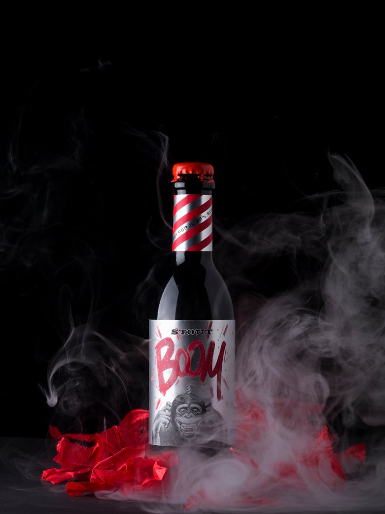
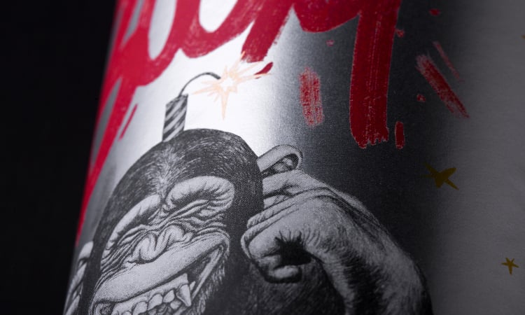
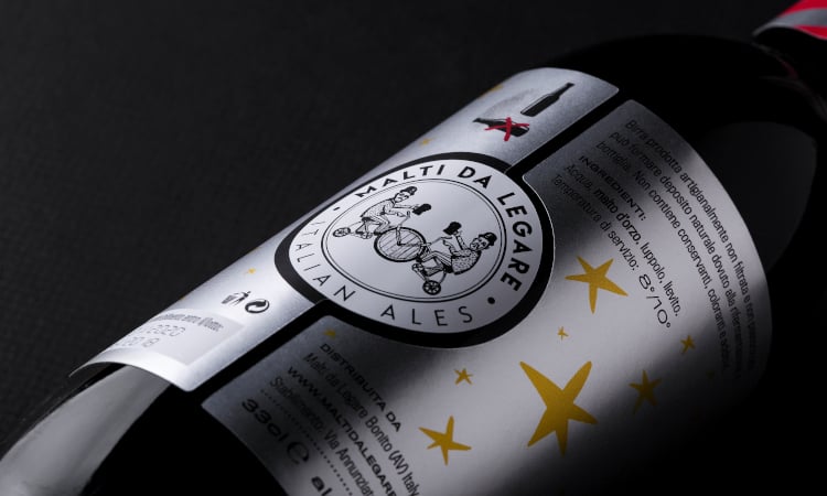
We were inspired by the idea of a real "Molotov" and the explosive combination of aromas such as malt, cocoa beans, coffee and licorice. The label was made on Vacuum Metal Silver Lux 83 by Arconvert, a silver metallic paper with high vacuum aluminum particles and high gloss, a standard of quality and strength that offers an incredible metallic finish and that stimulates the view as well as the tip of your fingers to the touch. With a mirror effect and reflections in motion it reminds those sparkles of "explosive" fire. In the printing process we wanted to use a white screen printing with four-color printing and a protective varnish, managed and realized perfectly thanks to the printer “ La Commerciale”.
In addition, such a glossy paper has been cleverly contrasted with an opaque writing, a BOOM that reminds us of graffiti and gives a young touch to a product with such historical value. For the calligraphic part we chose an expressive brush always with an urban touch to connect and make coherent the whole design.
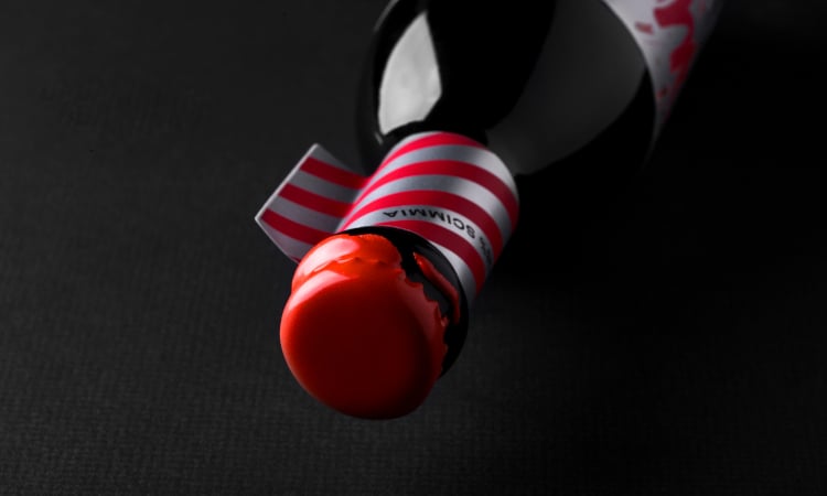
It’s a gold label! Thanks to its strong visual impact and its accurate graphic composition the project was selected at Best Label Beer 2020. The innovative label on the neck and the sealing wax were the two important details that gave a sense of coordination and completeness to the entire design.
5. Describe the customers request. From the starting brief to their final word, which were their needs? And waht about your goals?
The mission was to reveal a bottle that was "explosive", a game of irony between festive mood and shocking situations and that had a real story to tell. We were asked to design a label that had a recognizable look and that at the same time made us smile. With great enthusiasm and dedication we immediately set to work.
6. Describe your feelings when you saw the finished project. Did the end product reflect your idea? Do the chosen finishings reflect what you imagine
When we saw the final result for the first time we were really excited because it was exactly the idea that we had thought and that thanks to La Commerciale, we managed to get an even more winning product than what we simply had in mind.
In this interview we talked about beer labels, but the light effects created by metallic paper can be adapted to a variety of products such as food labels or cosmetics. If this case study has inspired you and you want to deepen the possibilities offered by this type of paper, write us! Our graphic team will be ready to assist you and also create a customized graphic if you need it.
Next

