Did you like the article? Share it!
Wine Labels - 7 inspirations from Arconvert
The world of wine and spirits is characterized by a high demand for added value and customization. Precisely for this reason, we are always looking for a new design, material and finishing to be able to embellish the label and packaging of the product; if you are a producer of wine or spirits and liqueurs, or a graphic designer looking for sources of inspiration for your customers, in this article I will be happy to show you various examples of labels with the highest added value!
All these labels have been produced on Manter materials of the Fedrigoni-Ritrama group (formerly Arconvert), which maintains the title of the industry leader in the world of adhesive papers for quality wine and spirits.
But let's get to the point, here are the fabulous designs especially selected by Fedrigoni - Ritrama (previously know as Arconvert) to inspire you!
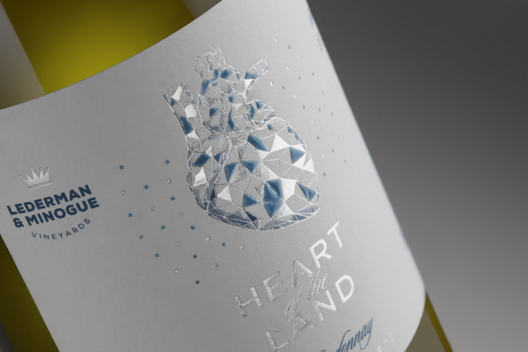
1. Heart of the Land – Chardonnay
This wine label sample is printed on Monet X-Dry paper, with a special treatment to resist humidity and the greying required for white and sparkling wines. Printed with a blue offset Pantone colour that makes up both the texts and the shades inside the heart, the vital centre of the label.
The heart and the product's name are hot foil stamped with a satin silver foil (such as Kurz Alufin Seta / SatinGloss).
There are some geometric details inside the heart enriched with thick glossy screen printing to crown it all.
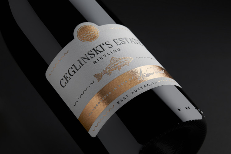
2. Ceglinski’s Estate – Riesling
Let's move on to this wine label sample, printed on Picasso X-Dry paper, a paper that in addition to having the moisture resistance treatment also has highly perceptible materiality and consistency, recalling a lot of papers with a pronounced structure such as the White Cotton always from the same manufacturer.
The label is printed in black colour, embellished by the presence of the hot pink copper foil (MTS 355 by Kurz).
The dry relief gives three-dimensionality to the fish present in the centre of the label. At the same time, the glossy screen printing in the name of the product guarantees both a tactile effect and a shine, increasing readability.
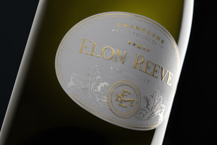
3. Elon Reeve – Champagne
This wine label was printed on Waterproof White paper. This paper is specially certified for the ice test, the infamous bucket that strains all sparkling wine labels.
The label has the particularity of not being printed in colour but directly with two hot foil passes! We find an opaque silver foil (such as Alufin Matt) and a gold foil (MTS 381) The label is punched as an oval, a shape suitable for cuvee bottles of sparkling wines that tend to have little space in height.
The label is further enriched by a dry relief that enhances the central name and the logo at the bottom.
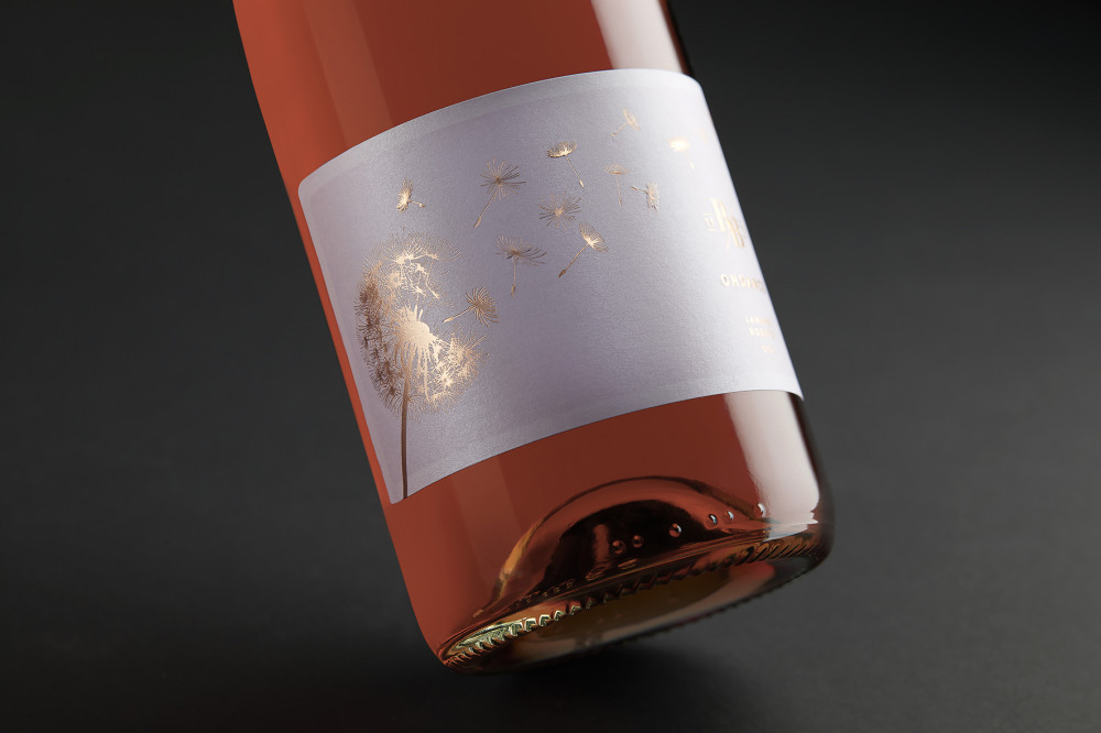
4. Ondance – Langhe Rosato
This wine label sample was printed on pearly paper with a rosy-violet paste colour. The name of the paper is Stardust Kunzite, an excellent paper for those looking for a material for rosé and sparkling wines and want a pearlescent paper with a matte rather than glossy effect.
The label features the main subject, namely the dandelion flower, printed with a good foil punch that enhances the details; all foil elements are printed with MTS 355 rose copper foil. The background colour is enhanced by a light pink background to create more excellent contrast between the paper and the foil that coexist within the wine label. A dry relief creates a pleasant three-dimensional effect on the petals of the dandelion and the logo and name of the product.
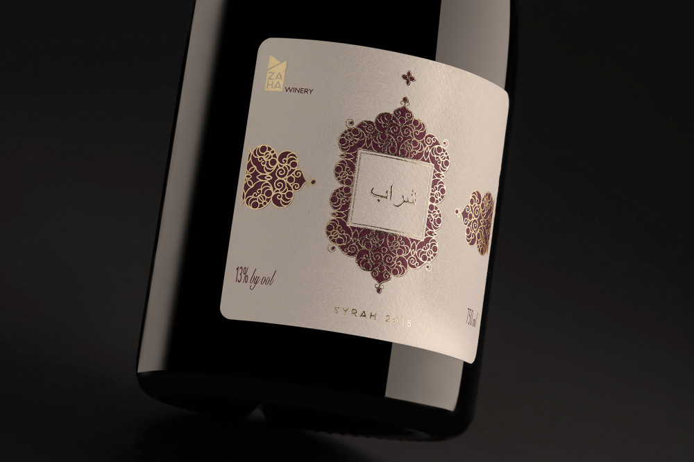
5. Zaha Winery – Syrah
The label in question is printed on an exceptional paper; the paper is Klimt, which is a natural paper that has been treated with glittery and pearlescent golden elements that guarantee it a Middle Eastern fabric effect. The subject printed on the label is in the Middle Eastern style, and the wine label has arabesque characteristics. .
The label is printed with a red colour that contrasts with the gold of the background and the foil. The hot foil that produces the decorations on the entire label is an opaque gold foil (MTS 428). Note the element written in Arabic in the centre of the label, which is not printed in hot foil but rather with the cast gold technique, which guarantees a thick and shiny print to the wine label. The cast gold is printed using screen printing frames. Instead of thick glossy paints, glue stick to the paper, which is then coated with a special foil, significantly differentiating the final result from the foil with classic relief.
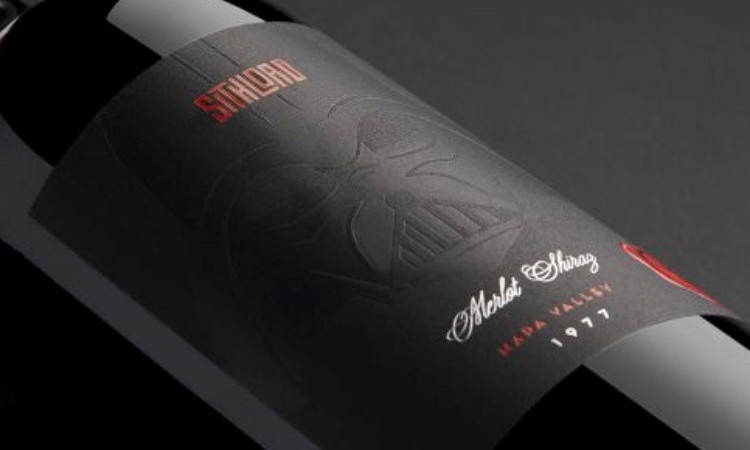
6. Sith Lord – Merlot Shiraz
This is a reference you probably weren't expecting. A "demo" label was born from the famous film to show the Intense Black Cotton paper, a paper with a velvety effect with an intense black matter. The central element is the Sith Lord's mask, which was printed with a debossing effect, squeezing the paper without adding colour.
To overcome the dark colour of the paper, the red color was printed with a Kurz Colorit red foil, which was in turn overprinted with colour screens on the wax-like seal. A matt silver Alufin foil completes the vintage and the type of wine, printed with a perfect character. The seal is raised with a glossy tactile screen printing, precisely to reproduce the effect of sealing wax.
You will have guessed it, but the labels in this list are not from actual companies but mockups proposed by Manter to show their materials. Still, I thought they were interesting subjects to show all the printing potential obtained, starting from an excellent design, quality paper, hot foil, reliefs and wide screen printing.
If you need more information, we are available to answer questions and any printing requests for all the processes you found in this article!
Next

