Did you like the article? Share it!
Helvetica: a font for versatile and legible sticker labels
The font of a sticker label communicates much more than the simple words: the choice of the font itself, its dimension, colour and the possible combination of different fonts contribute indeed in defining the style of a product and – as a consequence – its marketing positioning. For this reason, it is necessary to carefully choose among the thousands of existing fonts which one (or which ones) can represent your brand at its best.
We could safely affirm that every font has its own personality: there are sophisticated, simple, sumptuous, young, funny, playful, elegant fonts and so on. By choosing a peculiar font instead of another one we are determining in advance which emotion we want to convey to consumer: it is therefore necessary to establish which product features we want to highlight and how to visually translate them.
Among the lot of fonts that graphic designers have at their disposal, however, there are some that perfectly suits different kind of products and application and can be considered an evergreen choice: among them, we cannot but include Helvetica Font.
Helvetica: one of the most readable fonts
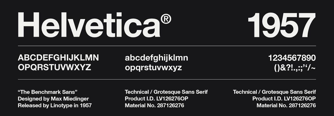
As the name suggest, Helvetica font was designed by Max Miedinger in Switzerland at the end of the 50s. It was an instant success: also thanks to a revolutionary wave that was taking place in that period inside the lettering world, the most important advertising agencies immediately started to choose this font for different clients, from electronics to fashion, from food to transportation. And, speaking of transportation, at the end of the 80s it was adopted for the New York City’s traffic signs.
Reasons behind such a success are pretty simple: Helvetica is an essential font, with clean design and good readability. From a technical point of view, it is a sans serif font – that means, it does not have the extending features called "serifs" at the end of strokes. Among its peculiarity, the most important is the amount of negative (white) space among the letters that is the same of the lines surrounding the characters. Also, Helvetica characters are always developed horizontally or vertically – never diagonally.
These features make it one of the most readable fonts, perfectly suitable to write on your label texts of a certain lengths – such as nutritional values, instructions, disclaimers… even at a small size, Helvetica font guarantees your information can be read without any difficulties and respecting the natural reading pace.
Simplicity and versatility for your sticker labels per le tue etichette adesive
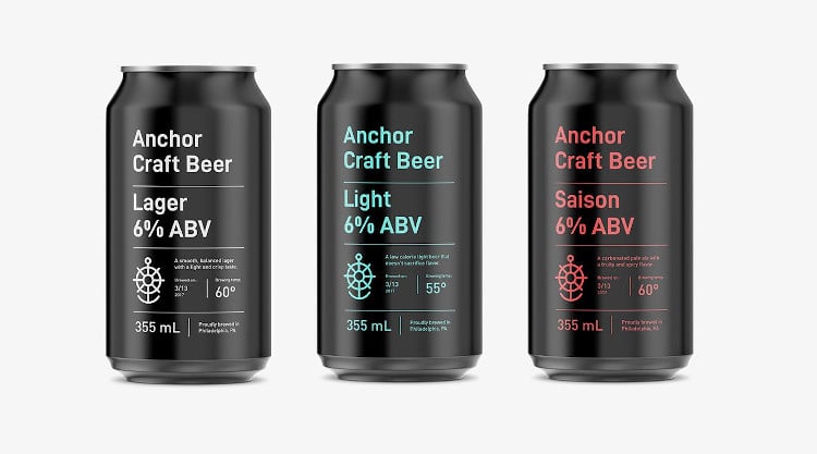
The possibilities to use Helvetica on your sticker labels are not limited – of course – to only informative texts! After a long period where it has been very popular, some designers nowadays tend to prefer more original alternative. In spite of some criticism, this font can be used for the logo or the product name in different situations:
- When you want to convey with your label the ideas of simplicity and cleanliness: this font perfectly suits cosmetic brands and personal care products.
- When the sticker label has other “important” visual elements such as elaborated backgrounds or images – and it is suggestable to opt for essential fonts to avoid weighing down the design.
- Helvetica is a web safe font that can be faithfully reproduced both on paper and on the web.
- Since it does not have serif, it can be used also on paper with a rich texture.
- Thanks to its versatility, Helvetica font perfectly matches with lot of different fonts and can therefore be used with a more decorative font to create an instant visual impact.
Next

