Did you like the article? Share it!
Labels for wine bottles: the most suitable colors and fonts!
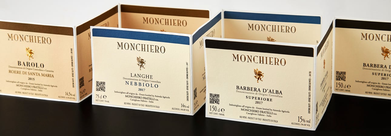
Whether you sell it on the market shelves or your e-commerce webpages, your wine bottle deserves an attention-grabbing label while communicating your company’s values.
Everybody knows, competition is becoming stronger: red wine bottle labels have to be attractive and reassuring by providing hesitant consumers all the information they may need.
Let’s see together how to choose the best colours and fonts to effectively communicate your products uniqueness and your business values.
Let’s see together how to choose the best colours and fonts to effectively communicate your products uniqueness and your business values.
The best colours for product labels when it comes to red wine
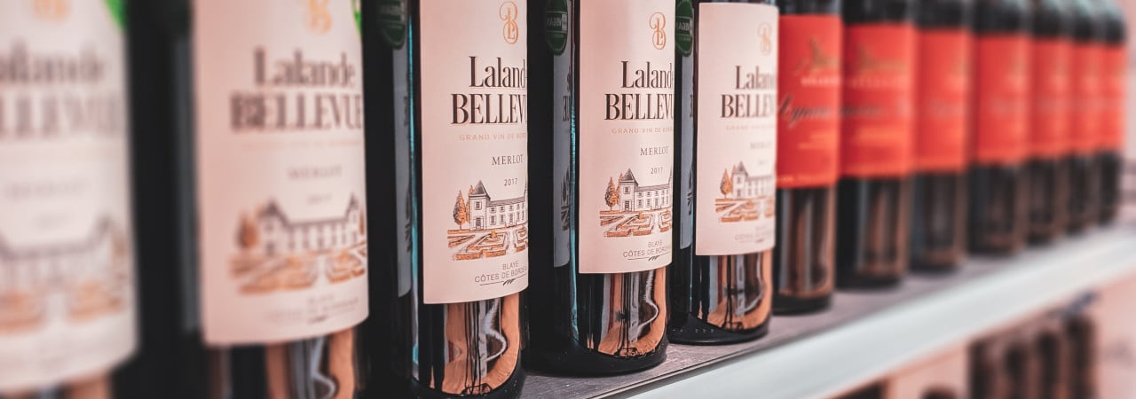
The first thing you have to consider if you are looking for the best colours for your product labels is, of course, the colour of the bottle itself. Red wine indeed is usually sold in dark bottles – generally green or brown – to prevent oxidation caused by sunlight.
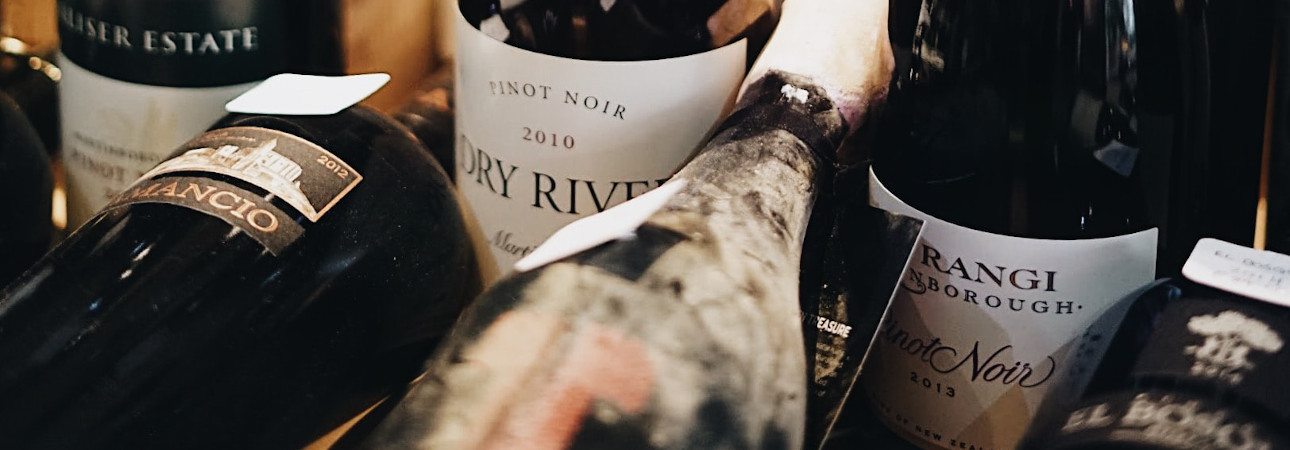
We therefore suggest opting for a label with white or really light background to make it stand out by creating a contrast. For what concerns the graphic elements, colours must be chosen paying scrupulous attention to the target audience and the product market positioning.
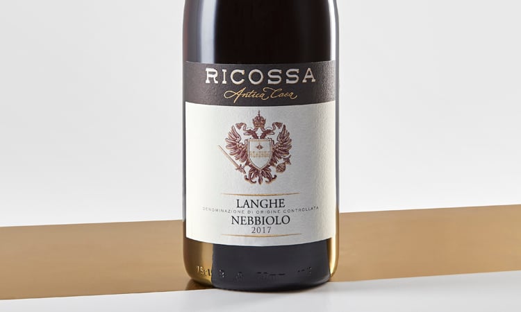
If you want to create red wine bottle labels for an organic or biodynamic product, we suggest natural colours such as the green – that immediately calls to mind the concept of eco-friendliness – but also the whole brown and beige colour palette that is associated with the earth element.
On the contrary, a red wine with a long and prestigious history produced following traditional methods has to keep a traditional style with refined wine bottle labels characterised by a vintage, calligraphic design. Colours to be preferred are black and white or soft pastel colours. A few golden details with hot foil are also suggested to add that extra touch of class and convey the idea of a valuable product.
Finally, young and innovative vintners can make bold and opt for intense and vibrant never-seen-before colours… hot pink, teal green, ochre or brilliant red, there’s so much room for creativity!
How to choose label fonts for your red wine
Once established the colour palette of your label, you have to choose the best font for you red wine. Just like colours, label fonts have to be consistent with your brand and meet the consumers’ need. A hard-to-read font can indeed result annoying and will unlikely persuade customers to purchase the product.
It is strongly suggested to always choose two or three label fonts according to the text position and function. Mandatory information such as the brand name and the bottler name and address, require a condensed, easy-to-read font such as Calibri, Frutiger o Futura, no matter the wine nor the company.
For what concerns the other two fonts – or the other font – for the name and the other elements of your wine bottle labels, the same considerations made about colours apply also in this case: it’s always better to consider the product and company’s unique features.
For an organic or biodynamic wine company, wine name can be represented with a cursive or handwritten font that best visually remind the human element and the closeness to the earth. Next to this one, you can choose a second font such as Helvetica or Gotham, for the other information or promotional text on the label.
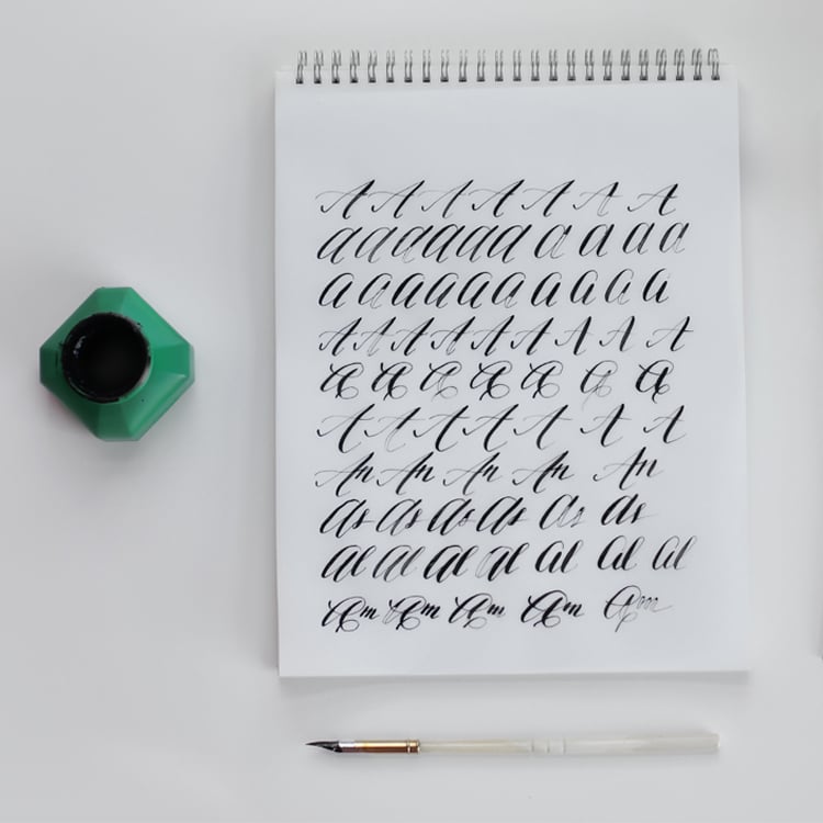
The name of a traditional wine can be enhanced with calligraphic typeface such as Zapfino, or old-style serif like those of Chianti and Barolo bottles, including Bodoni or Traian. Explanation and other text for these red wine bottle labels can be written with a different font, notably Futura, Minion or Garamond.
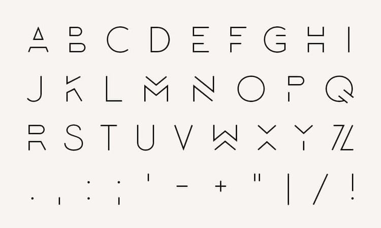
Young and modern companies will have carte blanche for the label fonts choice as well, as long as it does not affect readability, as previously pointed out. For these wine bottle labels, it will be possible to pick from a wide range of fonts, from modern and minimal like Montserrat, to peculiar and artistic font like Lombok or Bebas Neue.
We really hope these advices for label colours and fonts can be useful to create the red wine bottle labels that perfectly suit your needs: eye-catching and valorising!
Looking for further advices on papers and finishings? Give a look at our wine labels section!
Next

