Did you like the article? Share it!
The communicative power of the “white space” | Graphic design
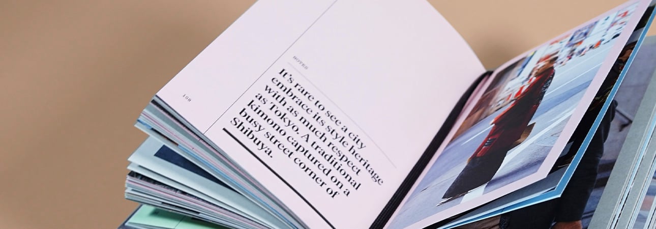
Order is a fundamental element in graphic design, and it is essential to know how to exploit it to your advantage, regardless of what kind of job it is. What gives a sense of order in a graphic elaboration and, of course, the primary alignments is the so-called “whitespace”.
The whitespace is considered one of the basic concepts of graphics, even if, unfortunately, it is one of the most neglected factors in design. Empty spaces are essential to give balance and harmony to a graphic elaborate, even if it often happens, especially when one is at the beginning, to fill every single space available. However, this trend represents a wrong approach to graphics.
The whitespace, often also referred to as "negative space", is one of the critical factors used in visual communication to give order and breathe the elements of a layout. Let's see what it is and how to use it in a project best
What is the ”whitespace”?
The whitespace can be identified as the space present between the various graphic elements on the page, and the page must be understood as a table or work area on which these elements are arranged. The whitespace is defined as such because it refers to the typical white of the paper, but it does not necessarily have to be white; it can be of many other colours rather than part of an image. Any empty portion of the page that does not distract attention from the main content can be classified as such.
For this reason, the white space is not to be considered an area to be filled, but rather it is to be understood as an element equal to all the others in the composition.
What is white space for?
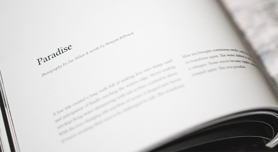
The whitespace should be considered an active element of the layout and not a passive background. It is a crucial element in communication because it helps convey a specific message by making its understanding direct and effective.
The whitespace can be used to our advantage to direct the observer's attention, creating a focal point in the project. This is possible because an adequate space around a particular element gives it breath, highlighting it and increasing its perception.
In graphic design, white space has a solid communicative power; its correct use makes a difference and can be the key to a successful job.
Types of “whitespace”
We can identify multiple types of white space based on the size of the areas themselves and based on how it attracts attention or not. Let's be clear!
1. "Micro" white space and "macro" white space. In this case, they are classified by size. The first, or the micro, is the space between primarily textual elements; it represents a "micro" white space, for example, the distance between paragraphs or lines of a text, between the title and the body of the text, rather than the space between words (tracking) or letters (kerning) or icons.
On the other hand, macro white space is the void between the most relevant elements of the layout, rather than between the graphics themselves and the outside of the work area or the margin.
We want to underline how the correct use of “micro” white space is essential in the textual parts. It is to be considered the basis of the readability of a text, especially if it is of a certain length. The suitable white spaces create rhythm in reading, and this is because our brain “reads” that space as a pause.
2. Passive white space and active white space. The other way to classify space is based on how it attracts attention or not. The " micro" space can be defined as passive space because it is necessary for correct reading, but it goes almost unnoticed to the observer's eye. On the other hand, the functional space is used to attract the user's attention and highlight some aspects of the graphics. We previously defined it as " macro" space, which is used intentionally to create a focus.
How to make the most of white space in visual communication?
What are the main functions of "white space"? We can summarize in 5 points:
# 01 Create a focus
The whitespace allows us to highlight our layout's focus, making that part easily identifiable and visible. We can direct the observer's attention by creating an adequate space around a particular object. The greater the white area used, the more the human eye will be attracted to the element in question.
# 02 Guiding the user with hierarchies
The whitespace is a principle of visual hierarchy; using it correctly among the various layout elements allows you to establish a hierarchy of the composition. This will help create an optical path to guide the user in the reading.
# 03 Improve understanding
The empty spaces help the user organize and make sense of the information he receives, thus improving the understanding of the content on the page. Proper use of white space helps to identify groups of elements.
It can be used to differentiate, separate or connect the different parts of a layout: adding ample white space emphasizes the difference between those elements of the composition, while a smaller space creates a kind of relationship between them for the Gestalt’s Law of Proximity.
# 04 Create a specific style
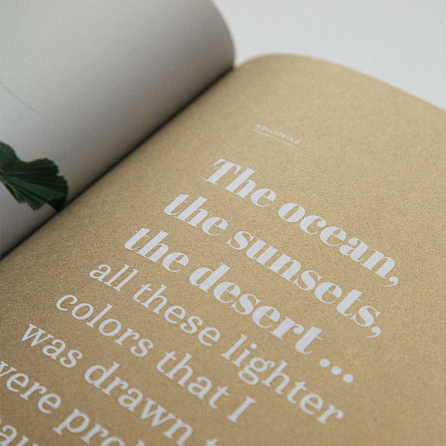
The whitespace has always been associated with a particular style of luxury and high quality, and its correct use helps create a specific atmosphere. More and more premium brands, such as Apple, are focusing their communication on their products by focusing on their quality designs and taking advantage of white space, which helps them put them in the spotlight.
# 05 Ensure balance and harmony
The correct management of white space gives order, cleanliness and lightness to any project. The result is a simple and easy to understand layout. In short, a white area guarantees an overall balance that will help you communicate your message more effectively.
The correct management of white space gives order, cleanliness and lightness to any project. The result is a simple and easy to understand layout. In short, a white area guarantees an overall balance that will help you communicate your message more effectively.
This article shows that white space is a crucial principle of graphic design and visual communication. The correct element can make your layout more professional, so don't be afraid to use it. Do not let yourself be neglected by letting yourself be deceived by the temptation to fill every space on the page; you will see what a difference!
We hope to have intrigued you with "white space" or "negative space" and given you some practical ideas on how to make the most of it in your graphic projects. Stay up to date for other exciting tutorials. The Labelado team greets you. Until next time!
Next

