Did you like the article? Share it!
Illustration in packaging design: how to characterize a produc
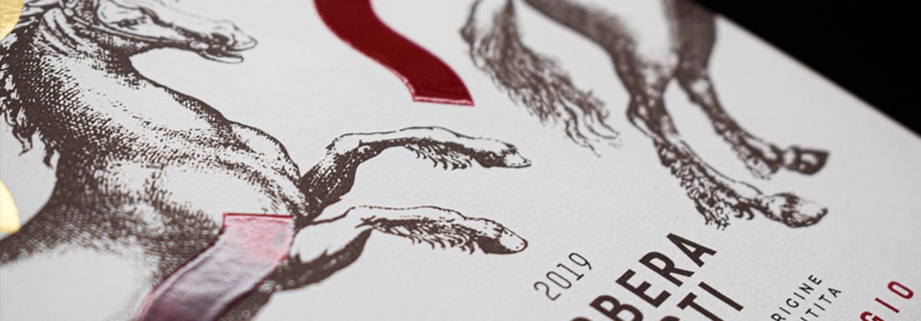
The illustration is a powerful artistic medium, which is not only used in art, and good illustration in packaging design can define and characterize a product and its reference brand. Illustration is one of the oldest forms of communication and is still the only way to tell a story without words
It is a tool with enormous visual and communicative power and is synonymous with exclusivity and quality when packaging. More than any other form of communication, it allows you to represent any type of thought or visual concept, even if abstract, quickly and effectively. Thanks to his high narrative and evocative skills, he can strike the consumer, arousing emotions in him.
With "good use" of illustration in packaging design, we refer to the choice of images that meet and respect the communication requirements established for that particular product. At the marketing level, it is essential to have precise objectives and packaging at the marketing level. Indeed, above all, the packaging must follow the communication line that has been chosen. Style and images are crucial, so care must be taken in designing graphics and choosing suitable illustrations that meet marketing requirements.
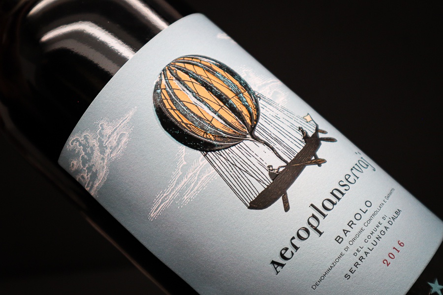
What is meant by Illustration?
By illustration, we mean any figure, drawing or photograph, or even better, any visual representation. It is a potent tool because it helps to clarify some aspects when placed alongside a text. With this article, however, we want to refer to the illustration in an artistic and creative sense, or as a designed work, the result of creating an illustrator or designer who created it specifically for that product. Even if it is reproduced and printed in more and more copies, the illustration in the packaging remains something that gives the idea of having been handcrafted by an artist.

The illustration in packaging design
Illustrated packaging is a particular communication choice, from a marketing point of view, as it helps a brand be recognizable. The illustration can make a product more attractive and captivating, creating a moment of attention for the potential consumer.
Illustrations can become the protagonists of the graphics of a product, becoming a fundamental element in the decision-making phase of a consumer's purchase. Drawn or painted that they indeed represent an added value for the package and the reference brand. The consumer perceives a product with illustrated packaging as being of premium range; precisely because a unique design element characterizes it.
It becomes essential to effectively convey a message because, through a particular style, one or more subjects can tell a story, defining the character of the product or brand, its cultural background, etc. In short, it allows you to develop a visual narrative.
The illustration is a complex world that includes various techniques and means of expression, such as collage, watercolours, prints and digital or analogue painting, and the more classical painted one. When it comes to illustrated packaging, to obtain an effective and quality result, it is necessary to contact two different professionals: a graphic designer, who will do the technical and graphic design of the packaging (box, label or doypack) and an illustrator who will take care of the illustrations.
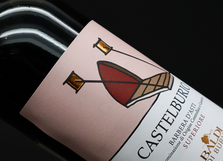
Define an illustrative style and subject
The styles available to an illustrator are many. Identifying your illustrative style and making it part of your brand identity will allow the public to associate a particular image to a specific brand, increasing their recognition. Furthermore, a specific style defines the type of message that you want to communicate. For this reason, it is essential to choose it carefully, through reasoned thinking at the marketing level. Crossed styles with different subjects will tell other stories and worlds and, therefore, additional messages.
Let's see together which illustrative styles you can choose and what they tend to communicate:
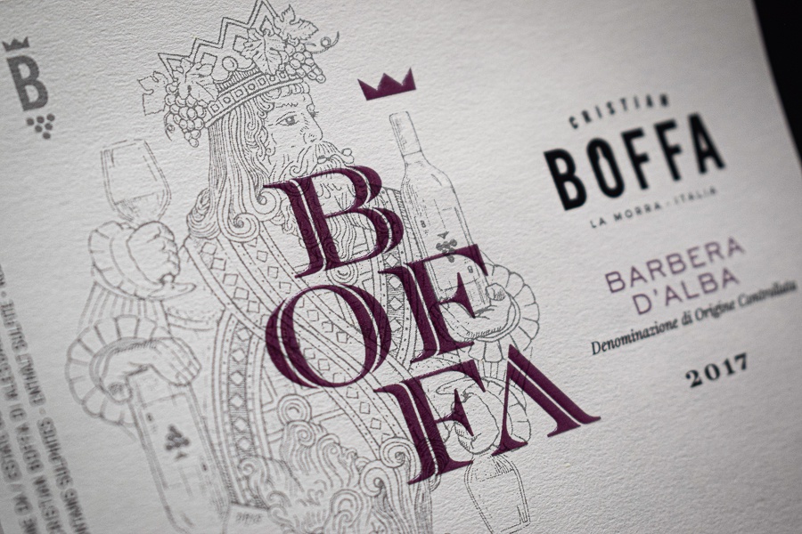
Black and white drawing
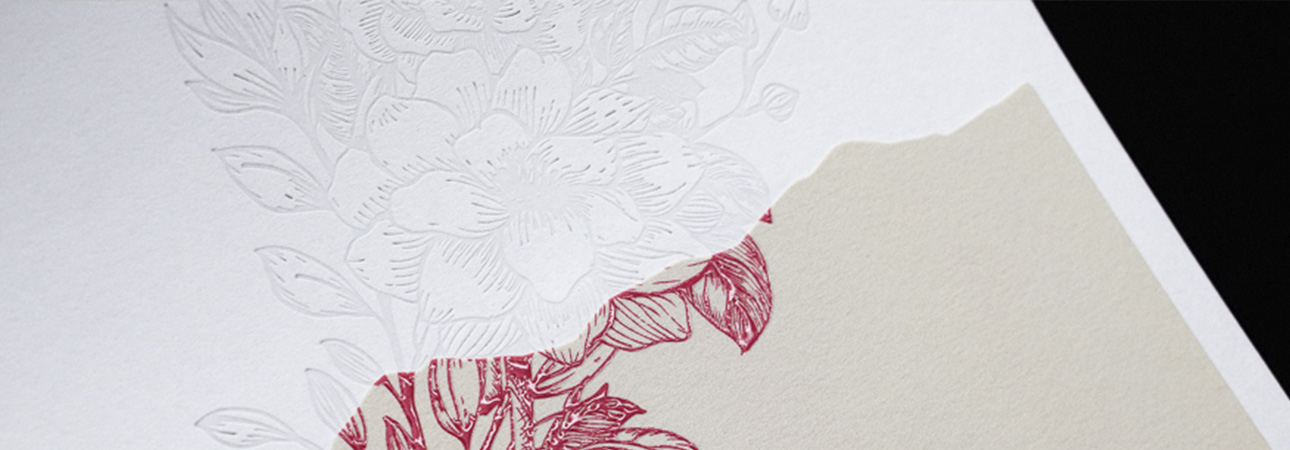
Reminiscent of the engravings of the past, for this reason, the illustrations made with this style have a flavour of tradition. They are used in the food sector precisely because they refer to ancient recipes or hand-illustrated herbalist treaties.
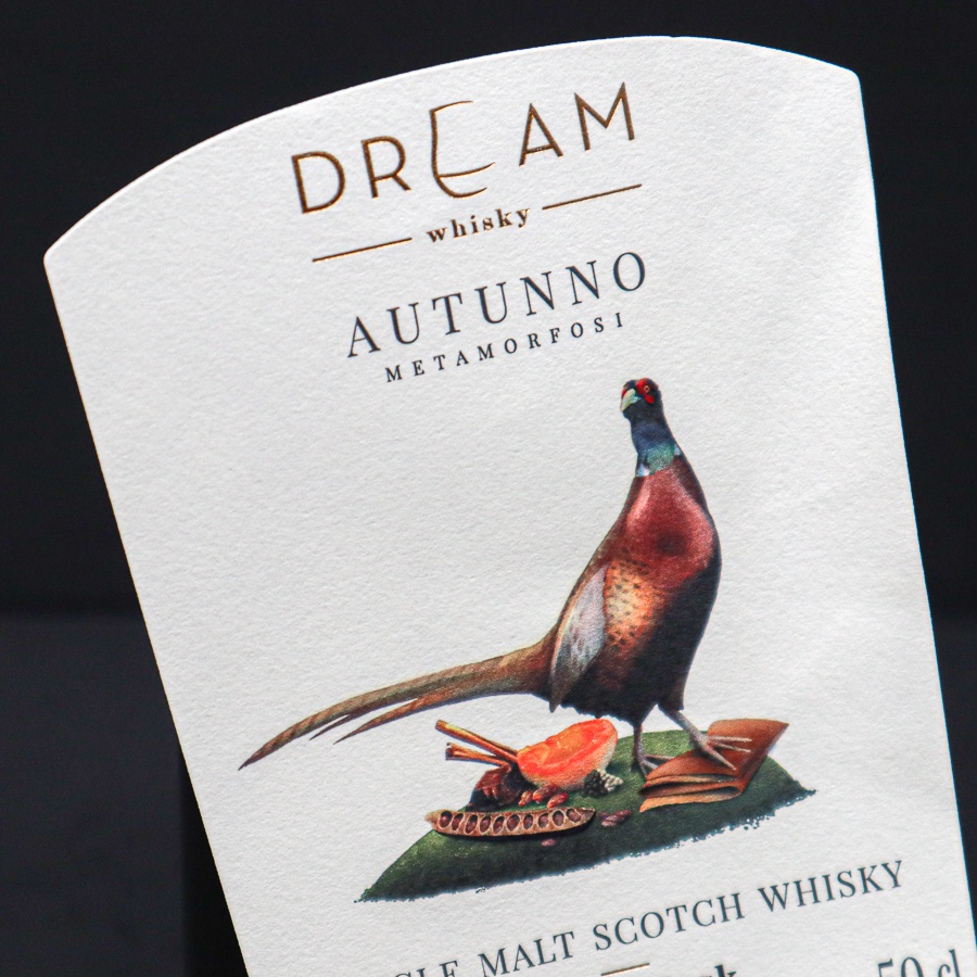
Watercolour
Fresh and watercolour styles can convey the idea of a refined product. Still, depending on the subject, it can tell the product in a serious or more pleasant way, communicating a different message.
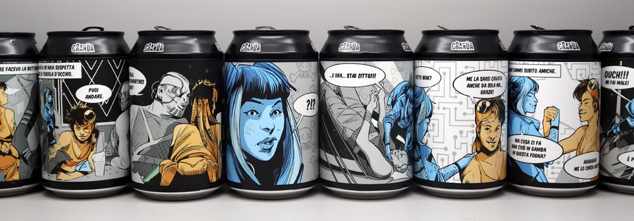
Comics
Widely used in the world of craft beers. We have an example made by us, where several lines of a brewery have been characterized by characters from a comic invented and designed specifically for these products. The comic style is suitable for products and brands that want to present the product fresh and carefree to attract attention and entertain.
If we have intrigued you with this project,
here is the complete article.
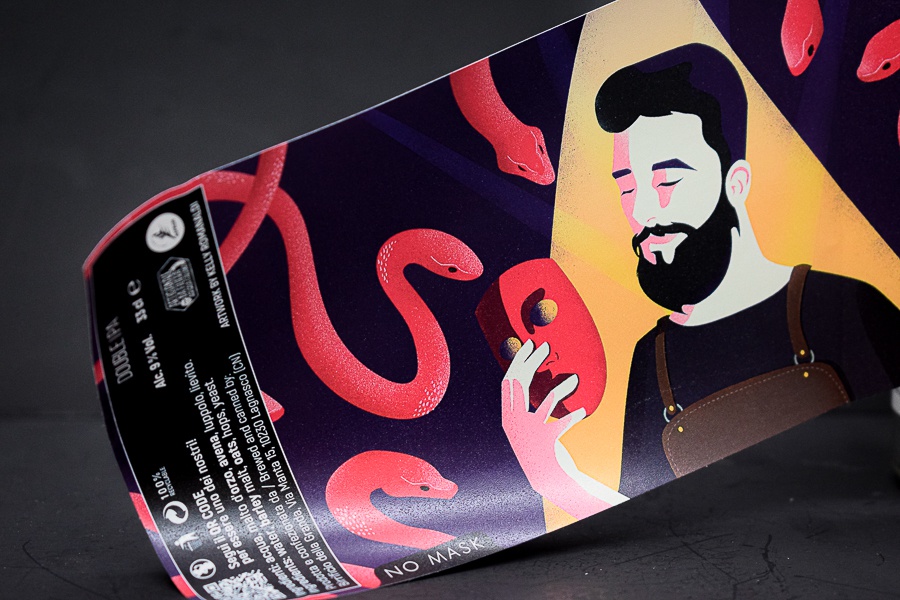
Vector / 2D and 3D
Highly impactful illustrations from a graphic point of view, are the result of new digital technologies that are exploited in the creation process and represent a new way to explore creativity. This particular style gives the idea of a new product on the market, is innovative and allows you to create colourful but sophisticated packaging.
Once the style has been defined, it is necessary to move on to the choice of the subject. The subjects of the illustrations can be of different types: from the personification of the brand or product to the representation of one or more characteristics of the product, to the story of cultural background or a story, which is behind the brand, its birth or tradition. The choice is linked to the marketing strategy designed for that particular product and represents the main idea of the packaging. For this reason, it is essential to do it carefully.
When to use the illustration?
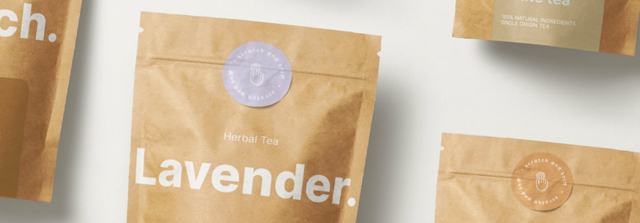
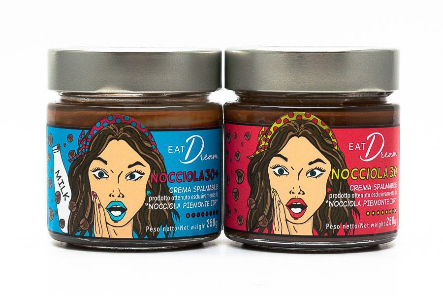
Food industry. The illustration in packaging design is particularly suitable for the food and beverage sector, alcoholic and non-alcoholic, as it lends itself well to making sure products are recognizable, conveying to the consumer their peculiar characteristics or the origin of the raw materials with which they are made. In particular, some products such as tea, coffee, and chocolate have an exotic origin.
Beverage. Another sector where illustrations play a decisive role is a beverage, especially when it comes to craft beers. Here the market is vast, and the competition is great; often, the products are similar to each other, so it is more than ever necessary to know how to characterize your product to stand out and stand out. In these cases, the illustration in the packaging helps create a relationship of trust with consumers, who tend to build loyalty by recognizing themselves in style suggested by the brand.
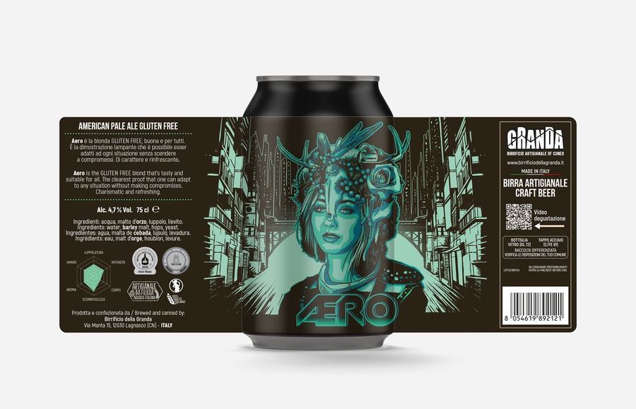
Limited Edition. Another excellent use of illustration in packaging is to create limited editions. Some packages can become real collector's items, thanks to the contribution of illustrators and designers. We are talking about limited editions. For example, illustration proves to be a handy creative tool in these cases. It will characterize the product to such an extent that the public will want to collect it, simply because they like it or because it becomes a piece of history of that brand over time.
In summary, good illustration in packaging design can define and characterize a product and its reference brand. Thanks to its communicative and evocative abilities, this allows to immediately transmit any message involving the consumer and making him excited, more than any other form of communication.
We hope we have given you some inspiration to illustrate the protagonist of the graphics of your product. If you have a project in mind, our team is at your complete disposal for any doubts. Until next time!
Next


