Did you like the article? Share it!
How to create a strong product line?

In all sectors, the concept of Brand Identity has now become fundamental, especially when it comes to a product line. In fact, a product line is a group of products that have the same brand and belong to the same company. This means that the Brand Identity, that is the way in which the company wants to be perceived by its target audience through the logo, the choice of the color range, the choice of products etc. it must be present in all the products of the line in a coherent and uniform way.
Today we see together in this short article which are the graphic elements we need to focus on to create an effective product line coherent with your Brand Identity. Let's see them in detail.
The logo
The logo is the essence of your brand identity. This is what allows the customer to recognize your brand 3 km away, obviously if you do not have problems with myopia like myself.
If you are thinking of a logo rebranding, we recommend you to always opt for simplification. After all, the pay of "less is more" always guarantees easy readibility and recognition.
The logo must always be inserted in the same position within all the labels or packaging of your product line. To facilitate reading, we recommend that you always insert it at the top.
In fact, our eye tends to visualize the first element placed at the top inside the label and then move downwards in search of additional information. Your brand logo must therefore be the first element in terms of weight and importance. After all, it's your trademark.
The color palette
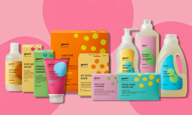
The chromatic aspect is also fundamental within a product line. Once the logo has been placed, you have to move on to the choice of colours for each product that is part of the same product line. Here you can give free rein to your imagination by choosing options that are part of the same color range or solutions in total contrast to each other. Do not forget, however, the brand identity is the key to follow. All the colors you select must be in harmony with your brand identity. Do not choose a trendy color like Pantone Illuminating 13-0647.
if it has nothing to do with your logo. Creativity and fashion are important, but consistency is so much more.
Take for example the Veralab cosmetic products by Cristina Fogazzi, aka Estetisca Cinica. It is a line of cosmetic products that are absolutely recognizable and consistent with the brand itself. A concentrate of purple that makes the packaging of each product unique, while maintaining consistency within the line itself.
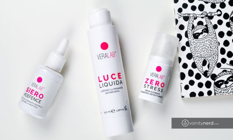
The Lettering
Now let's move on to the textual part of your product line. It is essential not to make a jumble of fonts that clash with each other. Limit your choice to a maximum of 3 fonts. The more variables are inserted within the product line, the more difficult it will be to create continuity.
Always remember that there are types of fonts suitable for different applications. For example, if you need to insert a different list of ingredients on each product, opt for a sans serif font that makes it easier to read. Also put the same groups of elements in the same position.
For example, if you have 5 different types of honey, enter the type of honey with the same font, perhaps serif or handwritten, in the same font height and in the same position. You can do the same for the ingredient list, for the manufacturer etc. This will simplify you customer life as he will be able to find quickly and easily the information he is looking for and will help you in the creation of all products. Once the main structure of the texts has been established, that's it.

Pictures
If you plan to insert images within your product line, make sure that the type of photographic shot is the same, in terms of lights, colors and framing. This will make your product line even more complete.
As you may have perceived, the creation of a product line is quite complex as it involves a series of important stylistic choices. But if you are clear about your brand identity, you will have nothing to fear. When you see the products of your line side by side for the first time, you will realize that you have made the right choices.
We are always at your disposal to support you in your choices. Write to us and we will be happy to help you.
Next

