Did you like the article? Share it!
Track21: a beer label dedicated to travel

A project for a beer label dedicated to the theme of travel. Track21 is not just this but much more. A project for a beer label that has involved and passionate us right from the start and which now makes us very proud. Let’s see more about it in this article.
From the idea of the creative studio BasileADV - Andrea Basile and the type foundry Resistenza - Giuseppe Salerno, Track21 is born: a beer with a rebellious soul, where instinct meets the intensity and prowess of an attitude that wants to be the example of those who knew how to fight and resist everything that has come. On the other hand, 2020 has taught us that life is unpredictable and resilience is everything. The idea behind this beer label is to tell a difficult, harsh journey in a completely original way, a bit like the one we experienced in 2020. What resulted is a proud product that restores the charm of travel and at the same time that makes you dream again.
The Track21 naming chosen for this beer label consists of two distinct parts.
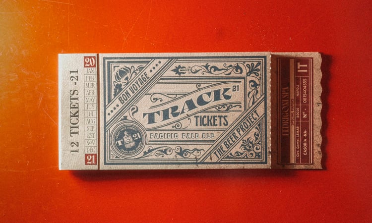
Track refers to the concept of path. In particular it refers to the definition of track, or binary, intended as a junction point between the various moments of life and which necessarily merge a starting point to an end.
The number 21 refers to the current year, 2021, which is full of hope for a better future.
The lettering proposed inside this beer label was designed from scratch. A graceful, uppercase and slanted style with alternating thicknesses between thin lines and thicker strokes to recall railway typefaces. For the 21 number they used a more linear font in contrast to the first part of the naming.
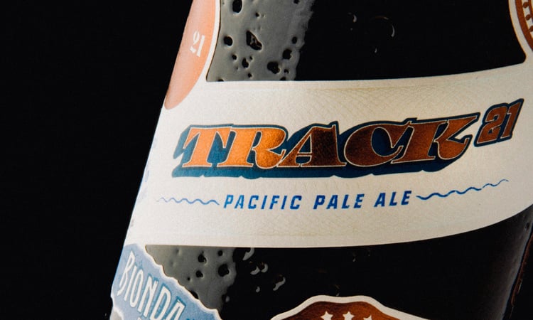
The predominant colors of this beer label are a deep blue and copper foil thanks to the hit foil supplied by Luxoro used fro several details. This choice gives depth and strength to the beer label.
The bottle has a very particular shape, irregular on the surface but perfect and unusual. Produced by Estal, specialists in premium solutions for packaging world, the bottle was perfectly integrated iwith the beer label. The beer label has empty parts inside that allow it to embrace the particular cylindrical silhouette, giving more prominence to the embossed details of the bottle.
There are many finishings on this beer label.
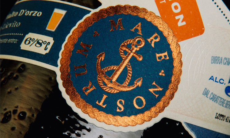
From embossing to micro-textured hot foil, from gloss varnish details to hot foil. All these finishings make the beer label complex and unique.
Numerous messages have also been inserted within the beer label, from the name and type of beer, to the information of its brewery, to messages of hope, up to the description of the ingredients. The whole is also joined by other graphic elements, such as the PAR AVION, postage stamp for air mail, the wind rose and the expression ENJOY YOUR JOURNEY to mention once again the journey and its beauty.
The bands that we see intertwining all over the label, connect every graphic and typographical detail, and outline at the same time all the trajectories of many different paths.
A beer label that is composed like a truly unconventional project.
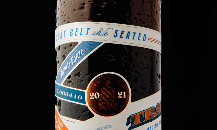
Track21 is a beer bottle that travels continuously, and that despite the difficulties, always arrives at its destination. If you want to know more about this project or you want to know some finishings details contact us through the form below. We’ll be glad to present you this project.
CREDITS
Next

