Did you like the article? Share it!
Grids and Layout: building a solid design
Good design's secret lies in how its elements are organised in space. Therefore, grids are essential tools of graphic design. Any project needs to have a structure to "anchor" to, and if concrete and steel beams are used in architecture, in graphic design, the grids act as a supporting skeleton.
This article will show how layout grids can help you produce more professional designs by giving your project a well-defined structure and a coherent rhythm. We will also see some proper rules and examples and how to build a cage optimally.
The grid is the supporting structure, without which your design would collapse or at least appear unstable and not very harmonious from the point of view of weights, shapes and spaces.
Unfortunately, not all graphic designers use layout cages and grids, especially self-taught ones. Many think they are extra in design, but this is not the case for several reasons. First, your project must be set up correctly, according to a reasoned cage. It is often not used, which is why you often see misaligned and unbalanced designs.
Another advantage of using a cage is saving time in the design. The cell becomes a guideline, which helps you design faster, as it partially limits your decision-making process, indicating specific points to anchor the various elements on the page. In addition, multi-page layouts also help maintain a sure consistency in the design. By doing so, you will see that your project will remain much cleaner and better organised and structured.
After this introduction, let's go into detail and understand what a layout grid means!
What is a layout grid?
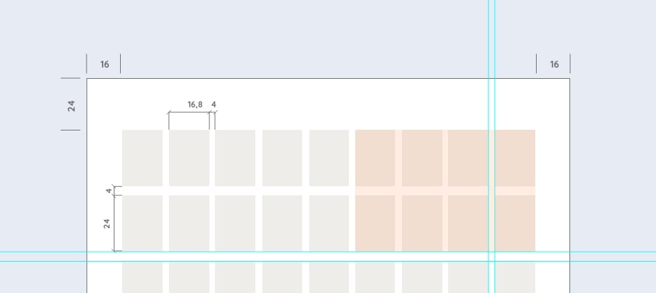
A grid is a structure of vertical and horizontal lines created to divide and organise the workspace. Regardless of its size or type, it is composed of:- Margins are the empty spaces on the sides of the format; the choice of their size is essential because the margins give the page a general shape, identifying the area dedicated to the content in which to insert the various elements.
- Columns divide the cage vertically and are the areas of space created between the grid's vertical lines; they can be of equal width or not, depending on the type of cage to be set. The distance between the columns is called the gutter.
- Flow lines are the horizontal lines that divide the cage in this sense.
- Modules are the small blocks created between the vertical and horizontal subdivisions.
Type of Layout grids
How you set up the grid can make a big difference in the final appearance of your design, so knowing which type of cage to choose to best set the job is essential. So let's see the main types of layout grids used by graphic designers:
1. Column Grid
The column grid is perhaps the most commonly used. This type of cage can prove to be a helpful tool for organising and standardising the mode of communication when, as a content, there is a series of heterogeneous materials. Columns can be used independently to enter content or combine them to create wider columns. Wider columns and margins leave more breathing space on the page.
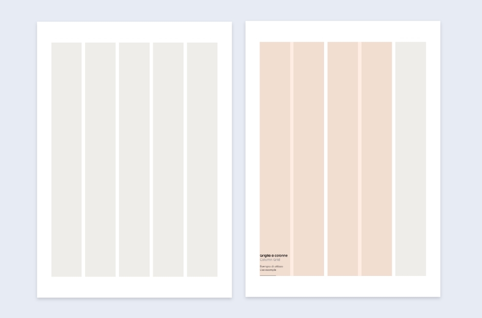
How to use it. We advise establishing the number of columns based on the format you have available; the smaller the width of your page, the fewer columns you should make. This is because too narrow columns result in lines of text that are too short, making them difficult to read. The optimal length of a line of text is 50-60 characters per line, but it is only an indication, not a law. Another tip is to double the number of columns you would typically use to increase the flexibility of your design. By doing so, you will have more "points" available to align the texts with, rather than images or graphics; merge the columns to create different compositions, keeping in mind that the lines of text do not go below a certain width. Your page will immediately appear more lively but at the same time balanced.
2. Modular Grid
Type of cage divided vertically and horizontally into equal parts. This combination generates a series of small content areas called "modules", which can be joined horizontally or vertically, creating numerous space areas of various sizes. It can be used in different ways by "breaking" some rules.
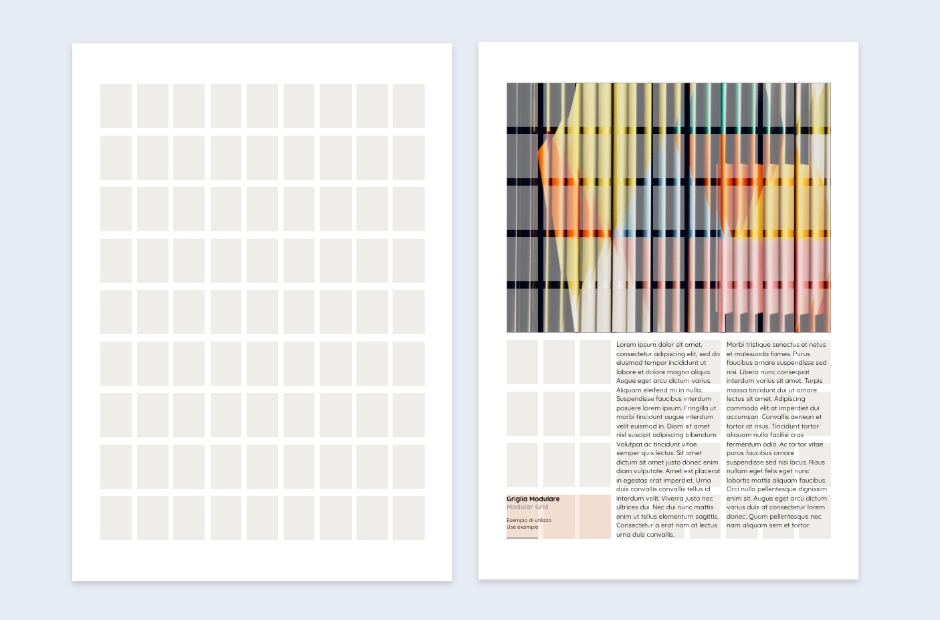
When to use it. This type of cage is beneficial in the case of complex layouts when there are several elements to organise. It allows space management by arousing a sense of order and mathematical rationality. The modules you create govern the arrangement and cutting of images and text.
Baseline grid
In addition to the two previous types, the baseline grid must also be mentioned. The baseline grid is a series of central lines on which the text rests, just like those in school notebooks, which helped us to write neatly. The concept is just the same; the grid of lines is a kind of scaffolding that supports the text and helps to keep it aligned between the various blocks or columns.
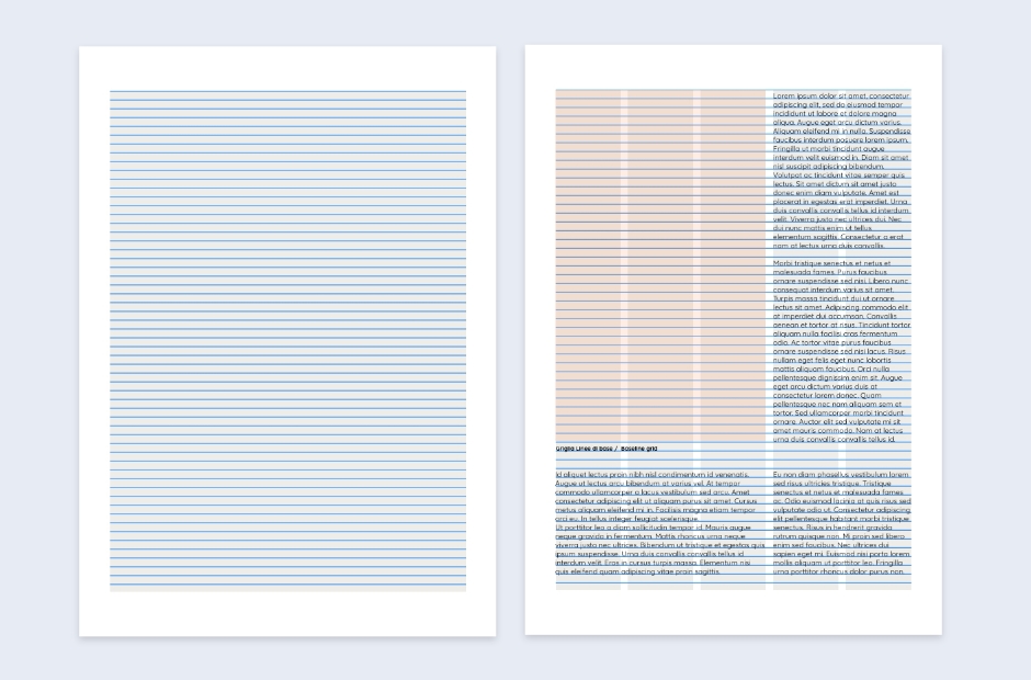
Why use it? An essential grid gives a fluid rhythm to the text, making the reading (and the sight) more pleasant for the reader. Composing text with the baseline grid also allows for uniform spacing between lines. The distance between lines of text is measured in typographical points and is typically based on body and line spacing to achieve a compact and balanced text block.
In summary, layout grids help designers position elements on a page, bringing a particular order into chaos. They are the only way to ensure that every graphic detail, text or image is perfectly aligned and limit the decision-making process during the design making the choices more accessible and immediate.
A good cage will play a crucial role in the success of your project in any area of graphic design you work. Experiment by moving elements on the grid until you find the right balance on the page, and remember how crucial it is to use it because it holds the design together and gives it coherence. See your next article!
Next


