Did you like the article? Share it!
CMYK colour method and printing: a guide for designers
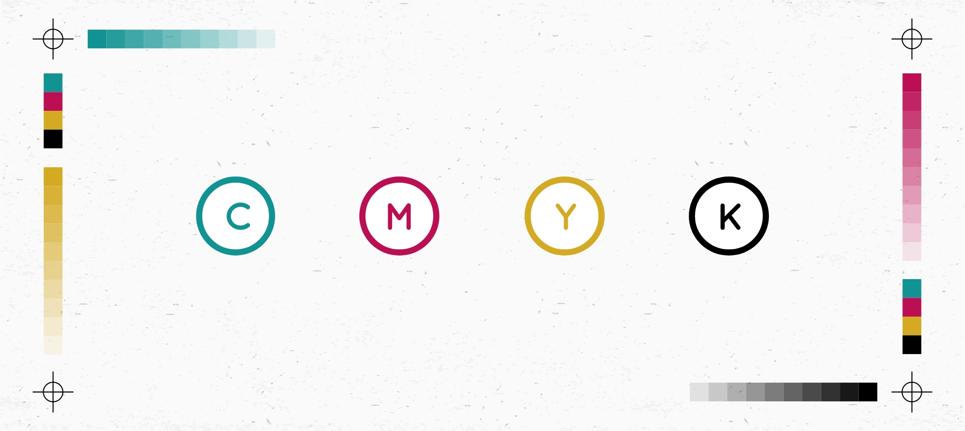
Knowing how to manage colour is perhaps one of the most complex aspects, but at the same time, fascinating for those involved in graphic design, and it is also one of those skills that every designer should have. It, therefore, seems fitting to talk about the "colour method" and, in particular, about CMYK colour for printing.
We have already discussed it in part on the Oppaca blog in an article dedicated to the most common mistakes when preparing a project for printing, which you can read here. Still, we want to get more specific to give you all the basics necessary to know the CMYK colour mode.
So, without further ado, let's finally find out the true meaning of the CMYK acronym.
What is the CMYK colour method?
Characteristics of the CMYK colour method
CMYK and RGB colour methods compared
When is the CMYK colour mode used?
Our tips for setting up your file before printing
What is the CMYK colour method?
"CMYK" is a colour model used for the reproduction of colour in print, as well as the acronym, which indicates the four primary colours used, more specifically:
- C stands for cyan
- M stands for magenta
- Y stands for yellow
- K stands for key or key colour, which today corresponds to the black channel.
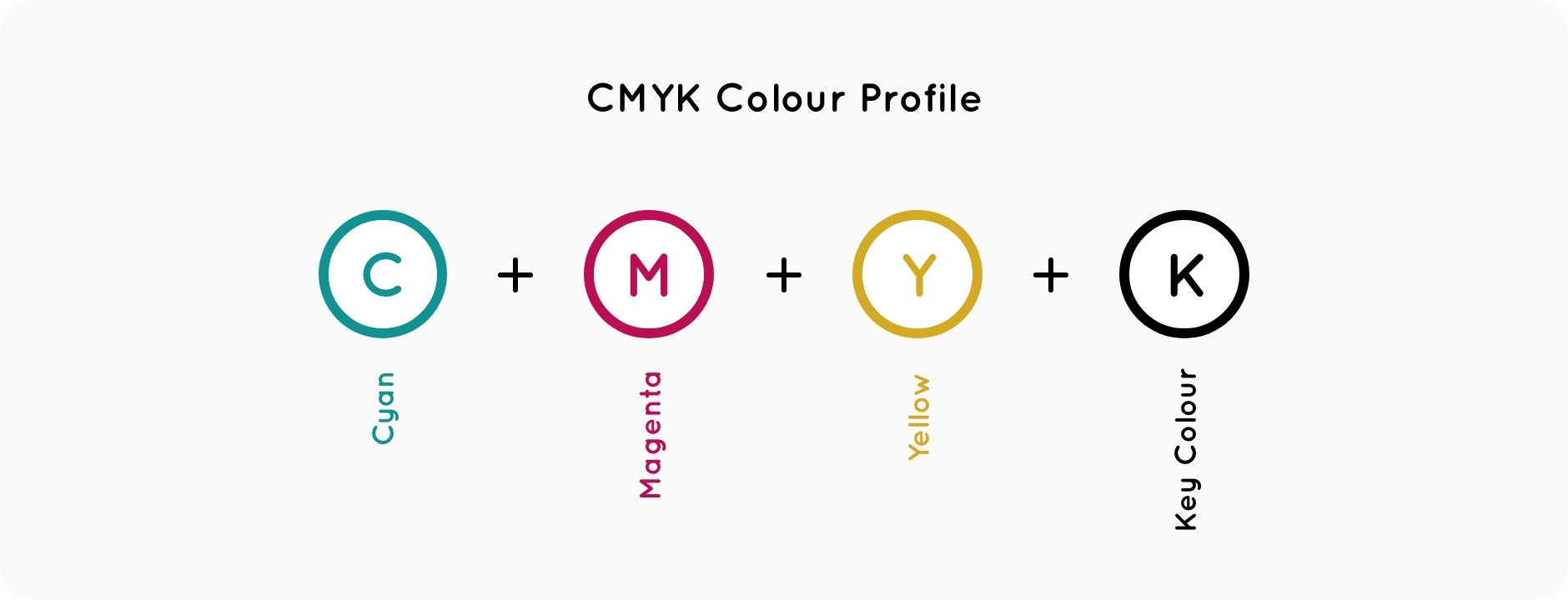
In short, the CMYK colour method is a scheme for combining primary pigments, and since it is based on the use of four colours in Italian, it is also referred to by the term "four-colour". When we talk about the CMYK colour method, we refer to a model in which all the colours are obtained by mixing different quantities of the four pigments (cyan, magenta, yellow and black). Doses are measured as a percentage; for each colour, you can have a value between 0 and 100.
CMY, or cyan, magenta and yellow, are the three primary colours, which teach us from an early age that by mixing them, you can get other colours, such as green, orange and purple, for example. Here, in the press, the same thing happens; the underlying mechanism is the same; it is only a little broader and more complex from a technical point of view.
A fourth was then added to these three primary colours, the one known as the key colour, or K, which proved necessary to obtain a complete colour print. Of course, the key colour in print today is black, but that wasn't always the case. In the early days of printing, the colours used as Key were brown, dark blue or black, depending on the cheapest ink to use. Technically, the sum of equal amounts of pure cyan, magenta and yellow should produce black; however, in practice, due to the impurities in the inks, it is difficult to recreate a pure black by mixing these three colours. This is why the fourth ink, black, was added to the colours, hence the abbreviation CMYK.
Did you know that CMYK is not the only existing colour space? Would you like to discover another colour method? Please read our article on the RGB colour model here.
Characteristics of the CMYK colour method
A wide range of colours characterizes the CMYK colour space, although it is limited compared to the spectrum visible to the human eye. The four CMYK colour make it possible to reproduce about 60-70% of the visible colours. The entire range of colours that can be produced using a colour model is called the gamut. If a colour is outside the CMYK colour gamut, it is usually replaced with a colour within the gamut, which is as close as possible to the original colour.
So, in summary, we said that the CMYK colour method creates many other colours when mixed, but how does all this happen? The answer is by subtractive synthesis.
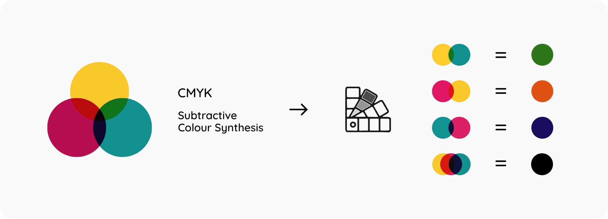
What does subtractive synthesis mean? The basic inks printed when the light hits them retain a part of the light spectrum and return the rest; that is, the colour that reaches our eyes. The more the ink absorbs light, the darker the resulting colour will be; black, for example, corresponds to the total absorption of the light spectrum, and for this reason, it cannot be defined as a colour. On the contrary, white originates from the complete reflection of the spectrum and therefore is not a single colour but the sum of all. How the perception of colour is generated is called subtractive synthesis since the colour we see is the remaining light reflected as the pigment does not absorb it.
CMYK and RGB colour methods compared
The CMYK colour method can be said to be an "opposite" version to another existing colour space, that is, the RGB (Red, Green and Blue) used by monitors, which is defined on the contrary as "additive". This is because the RGB primary colours combined at 100% brilliance produce white, while CMY primary pigments mixed at maximum concentration produce black.
In the RGB model, the colour is produced with the light, while in the CMYK colour method, through the inks. The two methods do not work in the same way, and it is precisely for this reason that the printed colour can never be the same as what you see on the screen, first of all just for the difference in brightness between the screen and the paper.
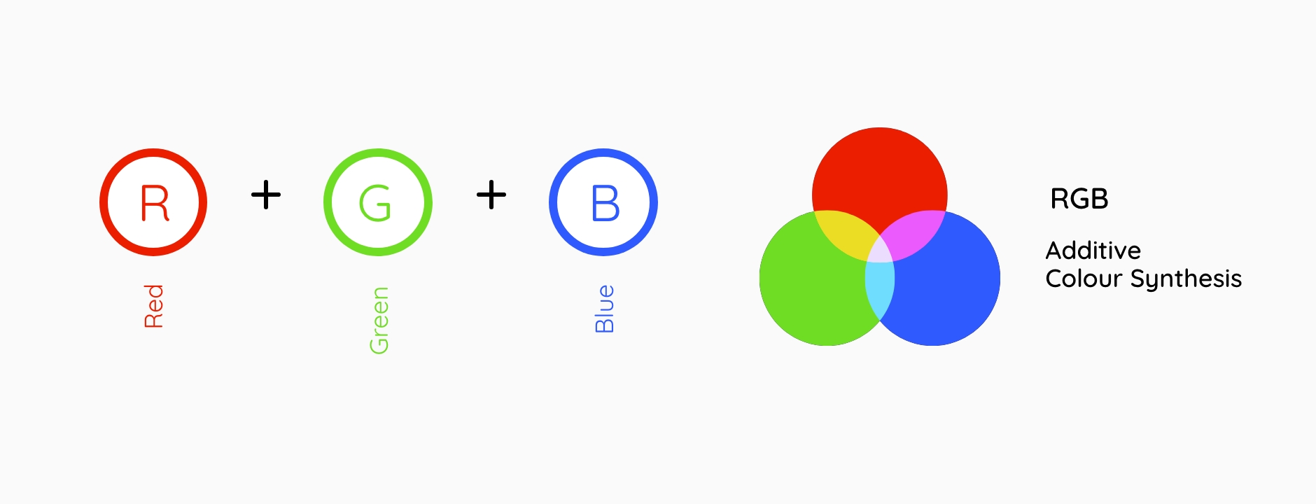
While some rare printers use the RGB colour space, there are several practical reasons why CMYK colour printing has been and still is the dominant model. On a monitor, the combination of light of the RGB components allows the creation of quite clear and bright colours. However, when combined as inks, the same RGB components produce colours significantly darker than those visible on the screen. This is because, in print, colours are not made by light and can only absorb it rather than emit it. Furthermore, the three RGB colours, that is, we repeat it red, green and blue, are dark inks already starting, and this makes it challenging to produce light colours such as yellow or lime green in print.
When is the CMYK colour mode used?
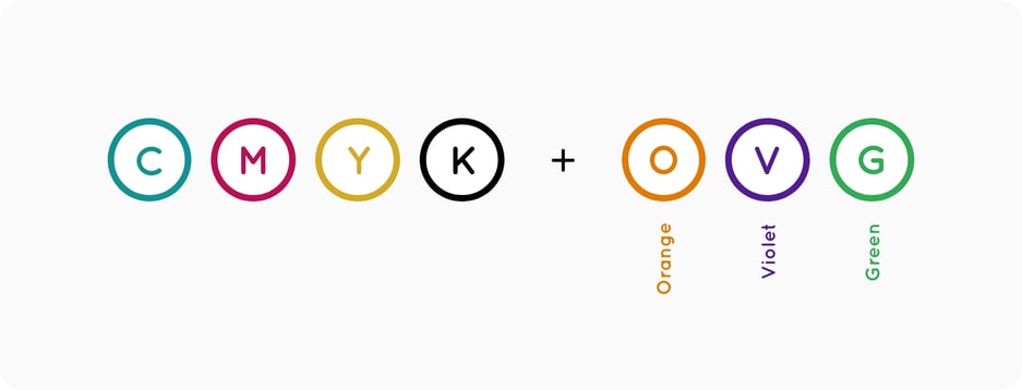
The CMYK colour method is the reference model for all those projects that must go to print. Four-color printing is currently the world's most widely used standard offset and digital printing system. The CMYK colour model is preferred because it allows you to cover a wide range of colours with the least number of inks.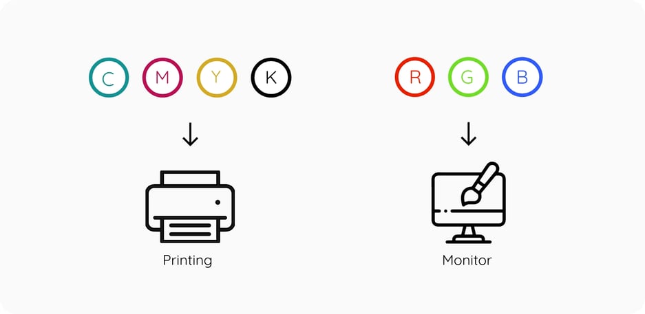 However, as anticipated before, with the four standard CMYK colour, it is not possible to recreate all the colours visible on the screen; for this reason, to further expand the range of printable colours, three other additional inks have been introduced: orange, green and violet (or the secondary colours: orange, green and purple). This method is called CMYK + 3; all printers do not use it because it is more expensive, but through it, it is possible to increase the reproduced spectrum and improve, in some cases, the brightness of the colours or their realism.
Therefore, if you are designing any design intended for digital use, the RGB model, while for printing, it is good to set the CMYK colour method. That's why, when we talked in our blog about how to best prepare a file for printing, we suggested that you set the CMYK colour method from the beginning because, otherwise, you risk choosing colours that will not be reproducible in print.
How does CMYK printing work?
We said that in printing, the primary inks are mixed to recreate the other colours; told in this way. However, it seems they are mixed as they did with tempera and brushes as a child. In printing, on the other hand, the mixing does not occur physically but through the perception by our eyes and brain that process the information by returning the colour.
We explain ourselves better. Suppose we observe a print at a microscopic level. In that case, we can see how it is created by a series of many single-coloured dots next to each other, which are not visible but give the perception of a compact colour, as with the pixels of a digital image.
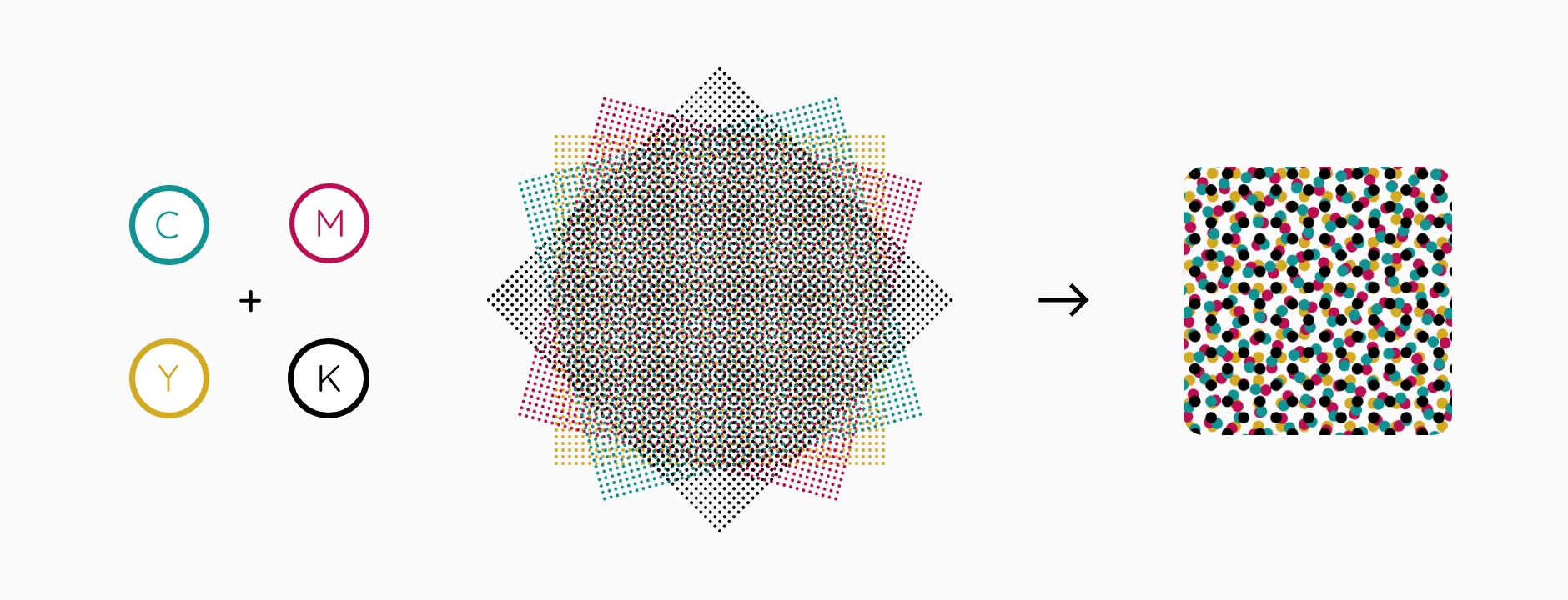
This process, which uses particular patterns called printing screens, is called half-toning. A screen is used for each CMYK component, each at a different angle. The different angles allow you to mix the four colours visually. The smaller and more angled the screen, the higher the print quality.
Our tips for setting up your file before printing
After explaining all the main features of the CMYK model in the printing process, we want to give you some tips for creating the perfect print file. First, when creating the print executive, you must set the correct colour method for printing: the CMYK colour method that allows you to manage four-colour process colours. Sending a print file with an RGB colour profile is perhaps the most common mistake, one of those things to which little attention is paid but represents a terrible forgetfulness.
We will never tire of saying that you cannot rely on your screen to define colours; if you want to check their performance before going to print with the production, the only way is to request a print proof to have a proper reference.
If you haven't worked with the CMYK colour profile from the start, don't worry, you can convert to the correct colour profile anytime. The important thing is to remember to do it before sending the executive to verify that all the colours correspond to those you have chosen in your graphics.

We can help you convert your file if we receive files in RGB. We will correct them automatically to go to print. Still, the colours can vary considerably if you switch from one colour method to another, so to avoid surprises, it is better to do it.
And and to find out more, read our dedicated article if you want to reread Oppaca's advice on mistakes to avoid creating the perfect file for printing.
Well, I would say that you have reached the end of this article. You know practically everything about the CMYK colour method and how it works, and you are ready to use it in future projects. The Oppaca staff will always keep an eye on the correct colour reproduction of your product.
Contact us if you have questions about the CMYK colour world or its application in the printing industry.
We will be happy to delight you with all possible notions.
Next


