Did you like the article? Share it!
Cosmetic Label Design: the complete design guide
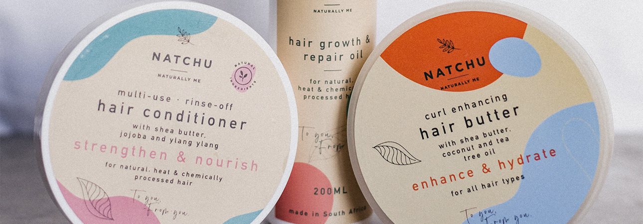
As you well know, aesthetics matters! The primary element with which a customer comes into contact immediately is your cosmetic label. It doesn't matter how great your cosmetics are if they aren't labelled correctly. The look and feel of a label cannot be created otherwise, and believe it or not. Cosmetic labels are the easiest way to make the right impression on your customers.
There are several factors to consider when designing your cosmetics packaging. This guide will cover every aspect and give you some ideas for designing quality cosmetic label design worthy of becoming the spokesperson for your product!
Here are the points we will address in this article:
- 7 stages of planning
- Choice of material
- Color palette
- Information to be entered
- Printing tests
Design (7 phases)
1. Choose the appropriate visual language
The visual language of your cosmetic labels plays a crucial role. Select the one that perfectly reflects your brand or product. The appropriate visual language will convey the right feeling to the end customer.
The visual language of your cosmetic labels plays a crucial role. Select the one that perfectly reflects your brand or product. The appropriate visual language will convey the right feeling to the end customer.
2. Define the style of the label
The style of your cosmetic label design will mostly depend on your audience. If you target a younger audience, a more extravagant style will undoubtedly be preferred, while a minimalist label will be the right choice if your target is more elegant. If you have an already known historical brand, you will undoubtedly want to follow a more traditional style. In contrast, modern cosmetics manufacturers have the advantage of indulging themselves with their imagination. This will lead them to design custom labels for eye-catching cosmetics; it is essential to know how to dare but always remain faithful to your brand.
The style of your cosmetic label design will mostly depend on your audience. If you target a younger audience, a more extravagant style will undoubtedly be preferred, while a minimalist label will be the right choice if your target is more elegant. If you have an already known historical brand, you will undoubtedly want to follow a more traditional style. In contrast, modern cosmetics manufacturers have the advantage of indulging themselves with their imagination. This will lead them to design custom labels for eye-catching cosmetics; it is essential to know how to dare but always remain faithful to your brand.
3. Choose images
Once you've defined the basic design of your cosmetic labels, it's time to move on to choosing which images to use. Our advice is to insert images that can represent the uniqueness of your brand or product. Dig deep and identify the elements that make you unique on the market, such as your ingredients, your production technique etc.
Once you've defined the basic design of your cosmetic labels, it's time to move on to choosing which images to use. Our advice is to insert images that can represent the uniqueness of your brand or product. Dig deep and identify the elements that make you unique on the market, such as your ingredients, your production technique etc.
4. Determine the shape and size of the label
It's time to choose the shape and size of your cosmetic label design. Choose from a standard label shape and size or something custom that can make your bottle stand out. Instead, you will choose a separate label on the front of the package and the back. Otherwise, you can only select a wrap-around label.
It's time to choose the shape and size of your cosmetic label design. Choose from a standard label shape and size or something custom that can make your bottle stand out. Instead, you will choose a separate label on the front of the package and the back. Otherwise, you can only select a wrap-around label.
5. Choose the legible characters
Believe it or not, the type of typeface you select is also necessary! The right font can help you communicate the right message and build your brand personality. You will be tempted to use more creative and imaginative fonts, but all your efforts will be in vain if legibility is not guaranteed, which is extremely important.
Believe it or not, the type of typeface you select is also necessary! The right font can help you communicate the right message and build your brand personality. You will be tempted to use more creative and imaginative fonts, but all your efforts will be in vain if legibility is not guaranteed, which is extremely important.
Do you want to know more about the topic?
I leave you the complete article here
Choice of material and colors
Paper
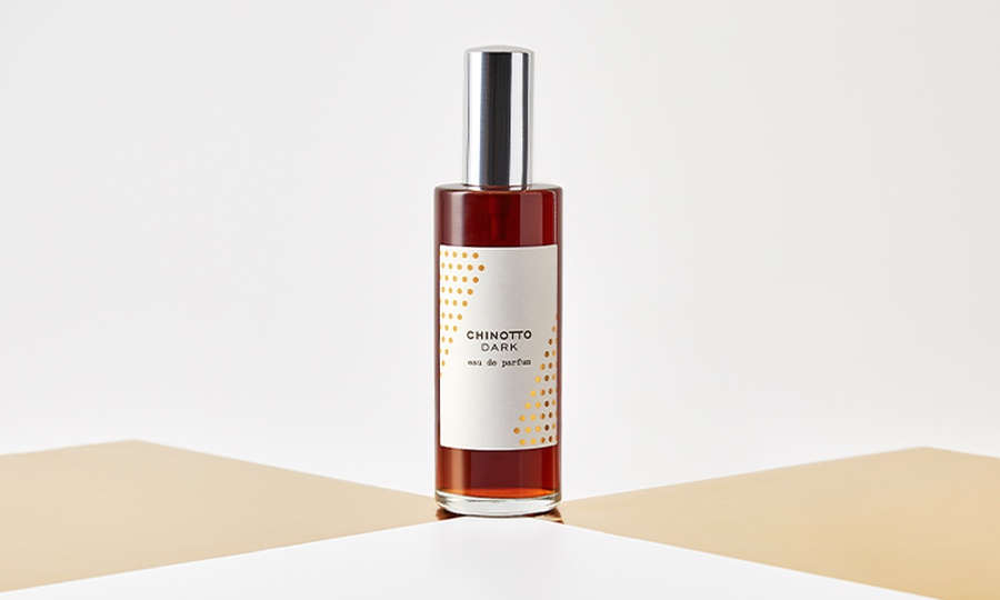
The material must also be in line with the brand and reflect the main characteristics to be communicated to the customer. For a brand, which stands out for its eco-sustainability and natural ingredients, it will therefore be possible to choose from a wide range of natural anti-pulping papers: from marked paper to laid paper or in cotton that also tactfully return the idea of simplicity and respect for the environment.
On the contrary, if you are looking for something more impactful and avant-garde, you can choose unusual cards, which evoke premiums and modernity; the most straightforward choice, in this case, could be a glossy or matte coated paper, but you can also choose other materials such as silver metallic paper or transparent polypropylene which will give your product a “no label” look.
On the contrary, if you are looking for something more impactful and avant-garde, you can choose unusual cards, which evoke premiums and modernity; the most straightforward choice, in this case, could be a glossy or matte coated paper, but you can also choose other materials such as silver metallic paper or transparent polypropylene which will give your product a “no label” look.
Colours
In choosing the colour, it is necessary to pay attention to three main factors:
• Choose a colour palette that is in line with the personality of the brand
• The colour must be able to attract the attention of the potential consumer
• You need to stand out from the competition
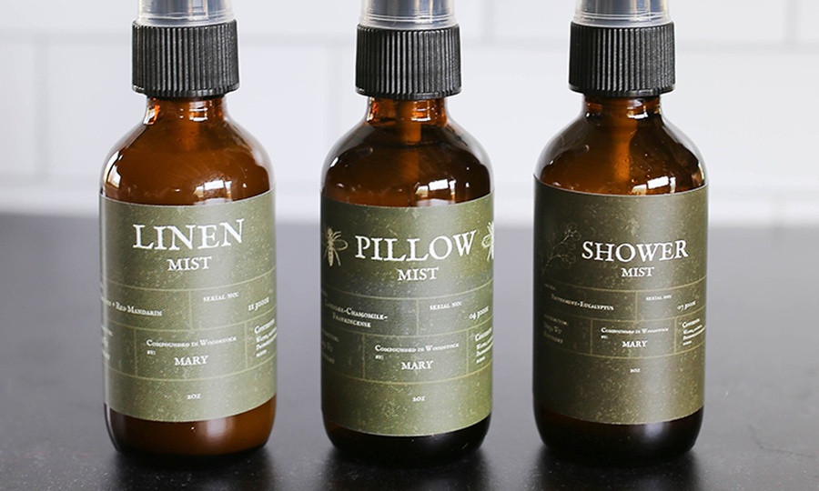
In a highly competitive market such as cosmetics, particular attention must be paid to this last point, which is sometimes underestimated. Suppose the cornerstones of your brand are eco-sustainability and respect for raw materials. In that case, green is a colour that undoubtedly recalls health and nature and could therefore be considered. However, the choice could also fall on soft and pastel colours that evoke delicacy and, at the same time, are original compared to the competition. You can choose bold and lively tones for a young and modern product: fuchsia, yellow, turquoise. If, on the other hand, you have in mind a label of simplicity and elegance, you can't go wrong with black and white, possibly adding touches of glamour with a silver or copper finish.
Are you interested in the topic?
You can find the complete article here
Information to be entered
1. Comply with the labeling requirements proposed by regulatory bodies
Each country has its own regulatory body, which decides the labeling requirements for cosmetics, which every cosmetic company must adhere to. In the United States there is the "Food and Drug Administration (FDA)", in Italy we have the "Ministry of Health". Each country is equally regulated by their respective regulatory bodies. So, the first thing you need to consider as you go about designing the labels for your cosmetic products is to adhere to the regulations directed by your country's regulatory body for cosmetics labeling.
Each country has its own regulatory body, which decides the labeling requirements for cosmetics, which every cosmetic company must adhere to. In the United States there is the "Food and Drug Administration (FDA)", in Italy we have the "Ministry of Health". Each country is equally regulated by their respective regulatory bodies. So, the first thing you need to consider as you go about designing the labels for your cosmetic products is to adhere to the regulations directed by your country's regulatory body for cosmetics labeling.
2. Declaration of identity or product identity
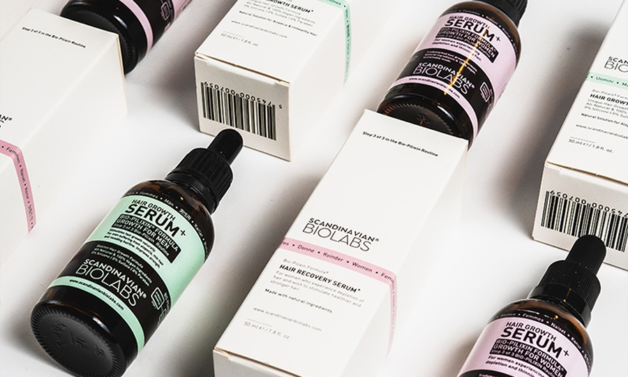
The declaration of identity or product identity, commonly known as the principal display panel or PDP, is the essential part of the label. The order of identity is the name of your product together with the net weight of the product, which you must insert on the FRONT of the cosmetic product package, and the common name of the product, the type (eyeliner, soap, cream, etc.).
The declaration of identity or product identity, commonly known as the principal display panel or PDP, is the essential part of the label. The order of identity is the name of your product together with the net weight of the product, which you must insert on the FRONT of the cosmetic product package, and the common name of the product, the type (eyeliner, soap, cream, etc.).
3. Net content or net weight
The net product content shows the quantity of the product. For your solid or semi-solid products, the net content must be in terms of weight; and for liquid products, the net content must be mentioned in terms of volume, for example, 8 ounces or 3.8 g. Make sure you place the net content at the bottom of the front label. Net content should not be higher than actual content nor lower than the actual content.
The net product content shows the quantity of the product. For your solid or semi-solid products, the net content must be in terms of weight; and for liquid products, the net content must be mentioned in terms of volume, for example, 8 ounces or 3.8 g. Make sure you place the net content at the bottom of the front label. Net content should not be higher than actual content nor lower than the actual content.
4. Information panel
Each cosmetic package should have an information panel, including the ingredient declaration, the manufacturer's address, and the warning statement. All ingredients must be declared in descending order, which means that the ingredient with the highest percentage is listed first, then the most elevated rate comes after the number two, etc.
Each cosmetic package should have an information panel, including the ingredient declaration, the manufacturer's address, and the warning statement. All ingredients must be declared in descending order, which means that the ingredient with the highest percentage is listed first, then the most elevated rate comes after the number two, etc.
5. Warnings
Warnings must necessarily be mentioned on some cosmetics, such as deodorant sprays, cosmetic aerosols, products containing alpha-hydroxy acids etc., to prevent any danger to consumers' health, especially for some products that contain flammable contents under pressure, such as products spray. The warning statement must be mentioned so that it is prominent and easily legible at the time of purchase.
Warnings must necessarily be mentioned on some cosmetics, such as deodorant sprays, cosmetic aerosols, products containing alpha-hydroxy acids etc., to prevent any danger to consumers' health, especially for some products that contain flammable contents under pressure, such as products spray. The warning statement must be mentioned so that it is prominent and easily legible at the time of purchase.
Do you want to learn more about the topic? Discover the full article here
Read also: Anti-counterfeiting labels for cosmetic products: what you need to know!
Printing tests
Proofing of your cosmetic label design is essential, especially if you are about to launch a new cosmetic product on the market and want a selective test that allows you to make an informed decision. Let's see what are the advantages of the cosmetic label design printing proof:
▸ Reduces testing costs
▸ Find errors in your file
▸ Find the right colour combinations
▸ Test the extra machining
▸ Allows you to choose the suitable material
▸ Find errors in your file
▸ Find the right colour combinations
▸ Test the extra machining
▸ Allows you to choose the suitable material
The cosmetic label printing test allows you to touch a faithful reproduction of the label on the paper or plastic material that you will use in production and future processes. Our packaging experts will be happy to advise you on the most suitable way to make a print test for cosmetic label design. The advice is free! We are waiting for you!
Are you interested in the topic? You can find the complete article here
Read also: How can I apply my labels manually?
Remember, getting your prospect to buy your product isn't that easy, but having quality cosmetic label design will help you out. Plus, properly labeled cosmetics will help both you and your customers.
Contact us, and we will be happy to help you. We at Labelado can follow you from the conception phase to the final production phase of your cosmetic label design. Write to us with this form, and you will be contacted as soon as possible!
Next

