Did you like the article? Share it!
What are the most readable fonts for food labels? 7 modern examples.
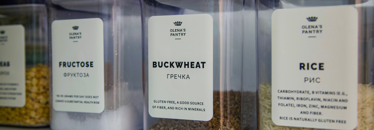
The food label must contain by law all the information useful to the consumer to make an informed purchase choice. This information must be easily readable. Whether you are about to create a label for oil, honey or jam, it is important that you choose easily readable fonts, especially for information such as the nutrition facts, capacity, manufacturer and of course the name of the product. To ensure ease of reading, you must first start by choosing the right font.
Not all fonts are readable in the same way and not all fonts have the same usability. Fonts can be divided into several groups. The first group of fonts is the one called "handwritten", that is the type of font that imitates human calligraphy. These are fonts with a great graphic and aesthetic impact but very difficult to read. Among the fonts to avoid, in order to favor readability, there are the serif ones, fonts that have graces and graphic embellishments.
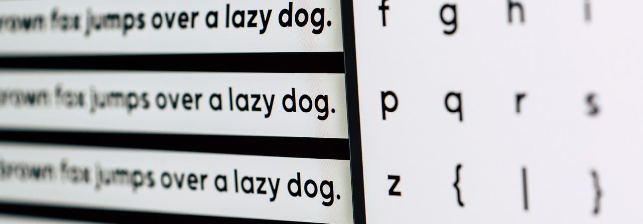
The most readable fonts for food labels are therefore the "sans serif" fonts. Let's see together some examples of new and interesting readable fonts for food labels.
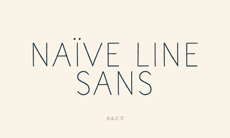
01 Naive Line Sans Font Family
The Naïve Line Sans is a very simple linear and very easy to read sans serif font.
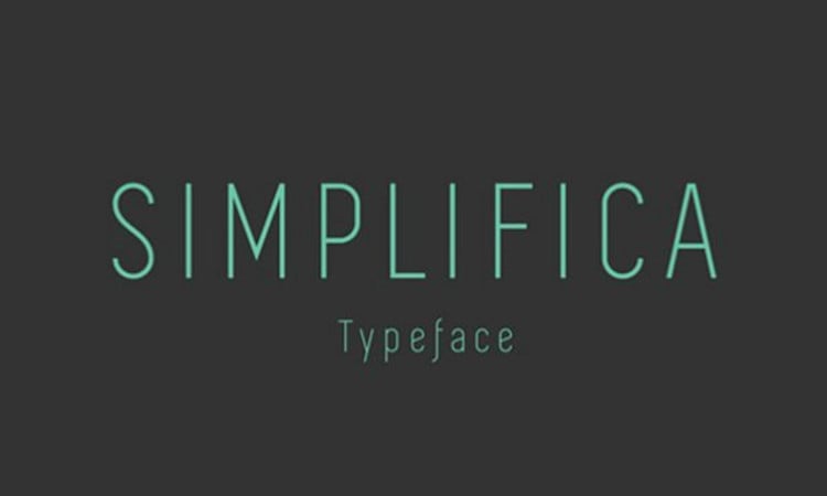
02 Simplifica
As you can guess from his name, the Simplifica font designed by Kaiwa is a clean, simple and uniformly thick readable font.
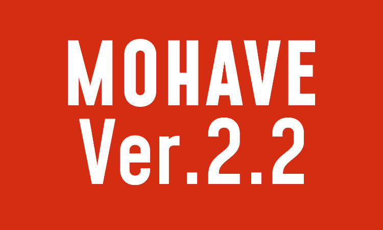
03 Mohave
Mohave is a font designed by Gumpita Rahayu that is particularly suitable for large texts such as product name or capacity.
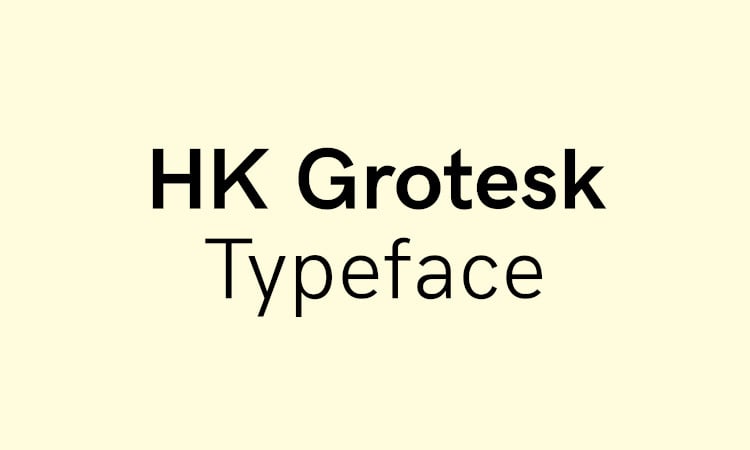
04 HK Grotesk
The HK Grotesk sans serif font designed by Alfredo Marco Pradil is inspired by the classic Groteske. It has great readability even for small texts such as those in the nutrition facts table or used in the ingredients list.
05 Hanken
The Hanken font is designed by Alfredo Marco Pradil. It is a simple and very rounded font. Its high legibility makes it perfect for large texts in text blocks.

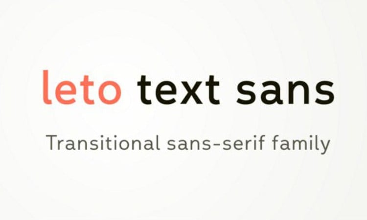
06 Leto Text Sans
For Leto Text Sans font, Glen Jan took inspiration from traditional sans serif fonts and created an extremely modern version.
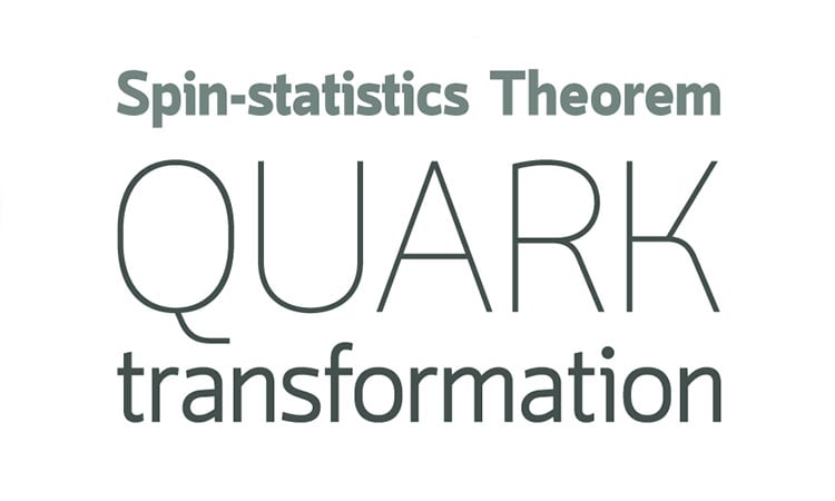
07 Quark
The Quark font, designed by Typomancer, comes in many styles and weights, making it perfect for a multitude of uses, from product name to nutrition facts table.
These are just some of the sans serif fonts that can be used to ensure great readability of food labels, never neglecting the style and visual appearance of the label. If you need some advice from our team, do not hesitate to contact us. The Labelado team will always be happy to support you in choosing readable fonts for food labels.
Next

