Did you like the article? Share it!
Layout grids: how to build one

Layout grids help produce more professional designs by giving your project a well-defined structure and consistent pace. Whatever your project is, it must be set up correctly, according to a reasoned cage; by doing so, it will remain much cleaner and more organised.
In the previous article, we introduced the concept of a layout grid; in this, we will show you how to build a cage optimally to design faster and maintain a sure consistency in the layout. Are you ready? Let's go.
As anticipated in the previous episode, a grid or cage is a structure of vertical and horizontal lines created to divide and organize the workspace di lavoro. To find out more, read the article here. We also identified the types of grids used by graphic designers, such as columns or modules, and discussed the baseline grid. Today, however, we want to guide you in building a high-speed and intuitive grid which can help design.
Building a layout grid: rule of thirds
One of the most effective ways to do this is to take advantage of the dimensional ratio of the support you are working on to build the structure of the grid itself. With this method, we use the rule of thirds in the design; that is, we proceed by dividing into three equal parts starting from your paper size.
In this way, divisions are created within the sheet, which act as guidelines for identifying the margins and the part of the page dedicated to inserting content. Since the divisions are in a stable relationship, what results is an essential visual harmony.
Probably it seems more complicated than it is, but let's see a practical example together.
Open your file and set the format you have chosen.
This method works with your page sizes, A4 or multiples, square, rectangular, etc.; in any case, a particular visual relationship will always be maintained.
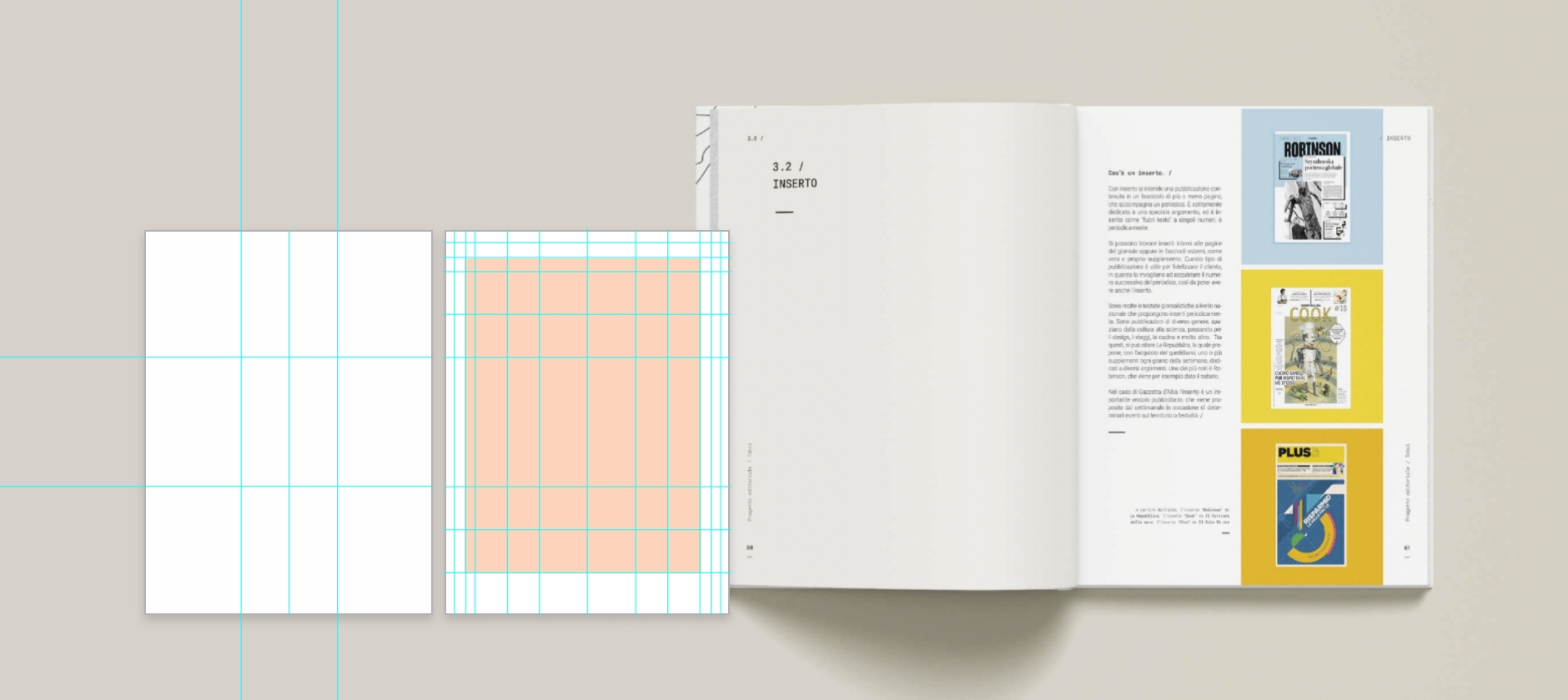
Start with your format, and divide the sheet into three equal parts. [If you work in programs like Adobe Illustrator or Adobe InDesign, take advantage of the ruler guides and the Align tool.] Divisions must be done both vertically and horizontally.
Once you have made the first division, proceed in the same way with the three portions you have obtained. Take the 1st third of the page and divide it into three parts, do the same thing with the 2nd, with the 3rd, the following ones and so on. So proceed until you come up with a solution that you like. One division after another, you will have created an accurate layout grid without calculations and too much effort.
The rule of thirds, which is widely used in photography, is also fundamental in the world of graphic design because it identifies those "strategic" or "strength" points, which for the viewer's gaze, represent areas of most significant interest, compared to the centre or on the outskirts, and create paths of exploration for the eye.
These are guidelines, but the number of divisions to be carried out will be evaluated based on your project and the format you have available. The larger the workspace and the more divisions you can create, and the more spaces you make, the more freedom of layout you will have in organizing the elements on the page.
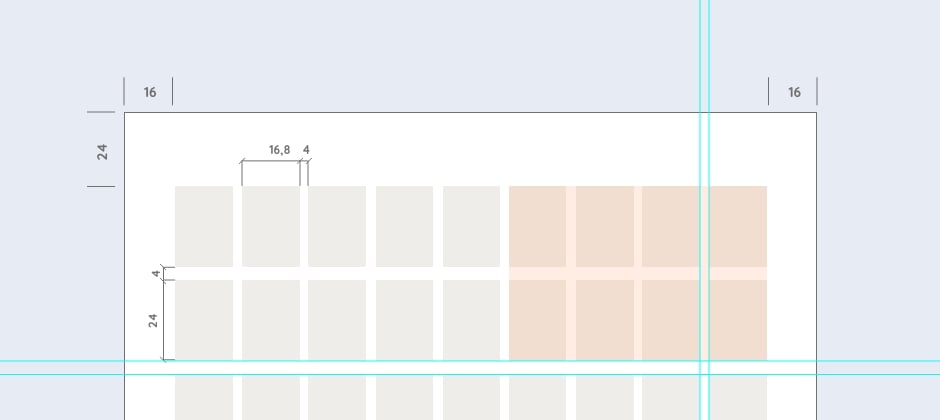
The pagination grids obtained with this method can serve as a basic guideline for identifying page margins rather than positioning key elements. For example, they can be combined with the column grid in the previous article to obtain a more complex grid.
Oppaca tips
All layout grids, including this one illustrated, can be designed symmetrically or asymmetrically. In the first, the margins are equal, and the columns have the same width. In the second, however, the margins are different vertically and horizontally, and the columns can also be. In asymmetrical layouts, however, it is essential always to seek balance.
On multi-page jobs, the grid can be used both mirrored and repeated; the choice is yours.
Experiment and find the right cage for your project. Use the layout grids with the rule of thirds to organize communication clearly and practically and give your project a harmonious, orderly and coherent aspect. That's all for today! Oh, I almost forgot: happy holidays :) We are staying for a few days, but don't worry; we will meet again on our return, more loaded than before!
Next


